launchdirectories.com
Landing Page Analysis
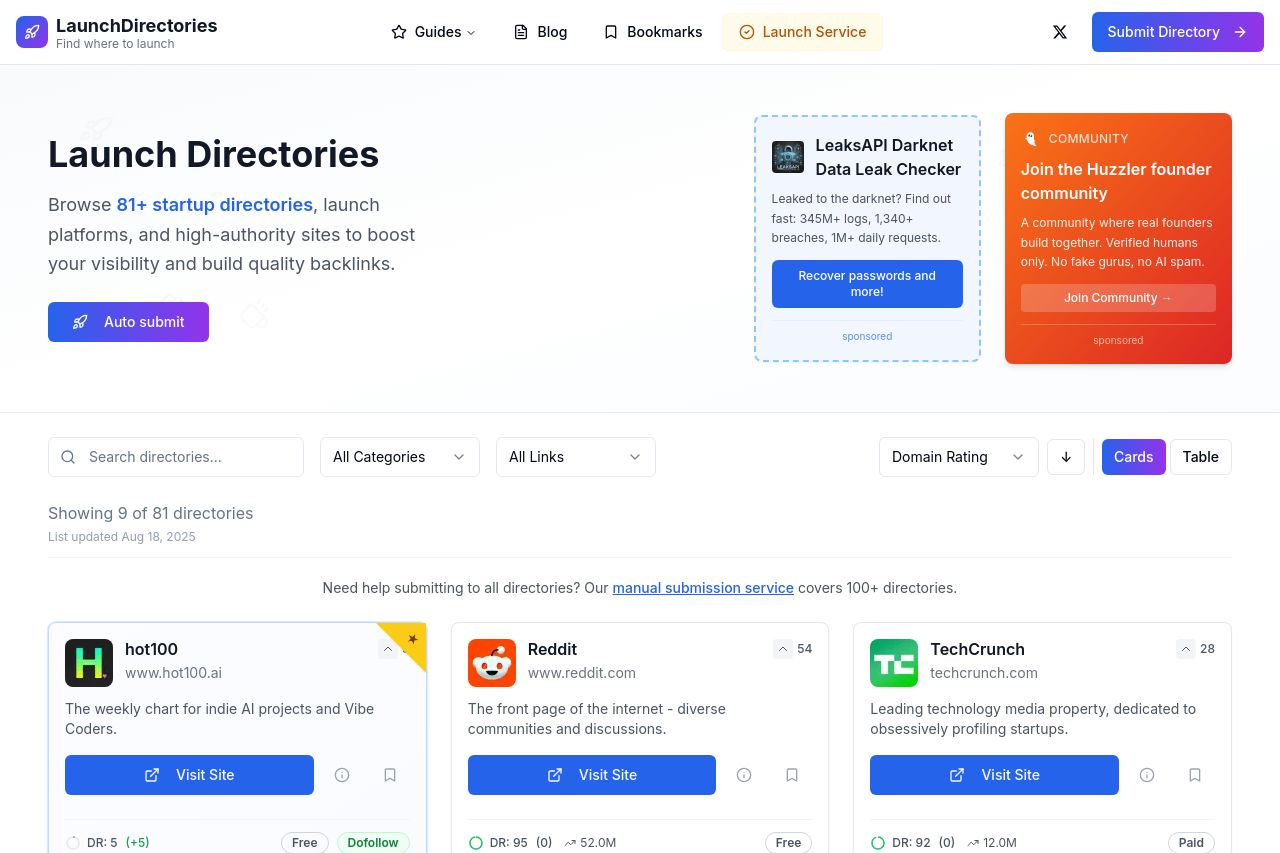
Browse curated startup directories, launch platforms, and high-authority sites to boost your visibility and build quality backlinks.
Summary:
The landing page for LaunchDirectories is clean and straightforward, which is a plus for readability. The main value proposition is clear, with an emphasis on boosting visibility through directory submissions. However, the design feels generic, and there are notable areas where it could be more engaging, especially for its target audience of founders and indie hackers. While the color scheme is consistent, it borders on being dull, and the calls-to-action could stand out more.
The credibility is well-supported through social proof elements like testimonials and client logos, but transparency could be improved by the inclusion of more detailed contact information. The overall structure is logical, but the information hierarchy could be enhanced by prioritizing key details right at the top. Additionally, while the site attempts to ease navigation with a search and filter system, the navigation could be made more intuitive.
- Improve visual engagement with a more dynamic and visually appealing design.
- Enhance the distinction and visibility of CTAs by using contrasting colors and strategic placement.
- Provide more detailed contact and company information to increase transparency and trust.