smartbooster.io
Landing Page Analysis
Nous sommes spécialisés dans la conception et le développement de logiciel web sur mesure en Symfony et VueJs pour booster votre productivité.
Summary:
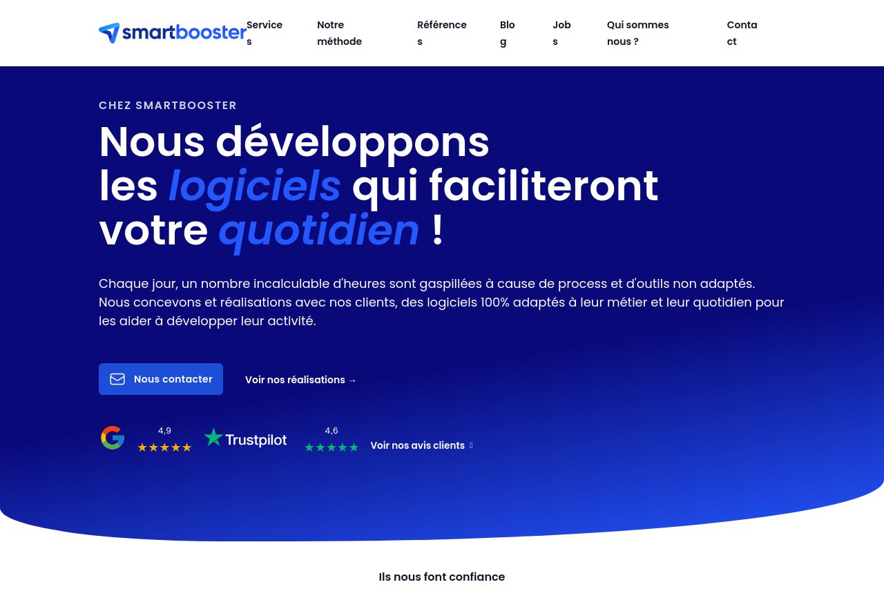
This landing page does a decent job showcasing Smartbooster's services, with solid design choices, but it's far from perfect.
The good: The overall design is clean, utilizing a consistent color scheme and engaging visuals that fit the target audience. The use of trust signals such as client testimonials and recognizable logos adds credibility. The message is somewhat clear about offering custom software solutions, and the tone fits the professional audience.
The bad: The value proposition isn't breaking new ground; it's generic and lacks punch. The text could be simplified—it's a bit verbose. Some sections feel cluttered and repetitive. CTAs aren’t standing out as much as they should, which could lead to missed opportunities for conversion. Also, the information hierarchy gets muddled in parts with irrelevant examples simply dumped onto the page.
- Revamp the value proposition to make it unique and engaging.
- Simplify and shorten the text for better readability.
- Enhance the visibility and placement of CTAs to boost conversions.
- Streamline some sections to present information more clearly.