scventures.io
Landing Page Analysis
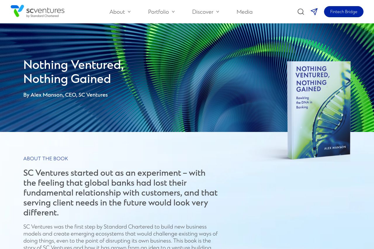
SC Ventures started out as an experiment – with the feeling that global banks had lost their fundamental relationship with customers, and that serving client needs in the future would look very differ
Summary:
The overall structure of the page feels cohesive, but there are significant areas where it could improve. The hero section does a decent job of presenting the main value proposition with the book prominently displayed alongside a vibrant background. However, the text is a bit dense and leans on the generic side, not effectively communicating specific benefits or targeting a distinct audience. The design is consistent, yet bland—there’s nothing striking that really captures or holds attention. The typography is quite standard, which is safe but does little to enhance readability. Call-to-action elements are few and somewhat lost, more direction or prominence in encouraging action could definitely help. On a positive note, the credibility is well-established through testimonials and recognizable partnerships, which boosts trust. Overall, it's clear and professional, but lacks the necessary punch to fully engage its intended audience.
- Enhance the call-to-action placement and design for better visibility.
- Simplify and break down text blocks to improve readability and engagement.
- Strengthen the messaging to more explicitly target the intended audience.