fromnora.com
Landing Page Analysis
Nora automates customer service emails 24/7 with AI that learns your business. Get instant responses and reclaim your time with 14 days free.
Summary:
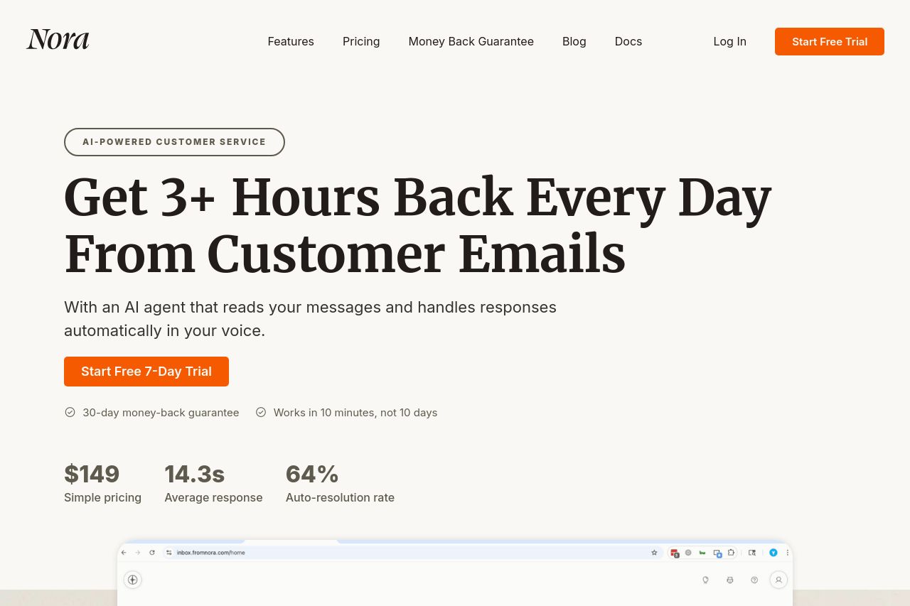
The landing page for Nora effectively communicates its value proposition with clear, bold text, claiming to save users time by automating customer service.
However, the visual elements could be more engaging to maintain interest throughout the page. While the messaging is clear, the page misses out on more engaging graphics or interactive elements. The color contrast is good, but the overall layout feels repetitive and could use more dynamic visuals to break up the monotony.
The section on pricing competently compares the service with traditional human support, highlighting cost benefits. The Open Graph title and description are clear but could be more enticing to click.
- Enhance the visual appeal with more engaging and varied graphics.
- Improve Open Graph data to make it more enticing.
- Add interactive elements or animations to increase engagement.