smart-ops.fr
Landing Page Analysis
Nous accompagnons les TPE/PME dans leur transformation digitale avec des outils no-code rapides à déployer et faciles à utiliser.
Summary:
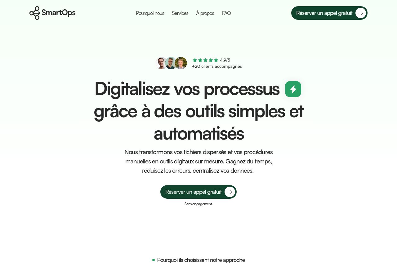
The landing page for SmartOps has a clean design with a clear structure. The value proposition immediately catches the eye, promising simplicity and automation. Sections are neatly organized, simplifying the path through the information. Consistency in typography and use of color balance the overall look. However, the messaging could be more engaging. While the benefits are mentioned, they could be reinforced with more impactful language and examples.
The visual elements are supportive but lack a decisive punch that would elevate the user engagement further. Credibility is fairly well-established with testimonials and client metrics, though the CTA could be better highlighted with more urgency or strategic placement throughout sections. The open graph image feels basic and doesn't entice engagement. Overall, it's a solid effort but could stand to be more dynamic in drawing visitors into the action.
- Enhance CTA visibility by varying placement or color.
- Add more real-world examples or case studies to strengthen messaging.
- Increase visual engagement with more dynamic images or graphics in key areas.