chummychat.com
Landing Page Analysis
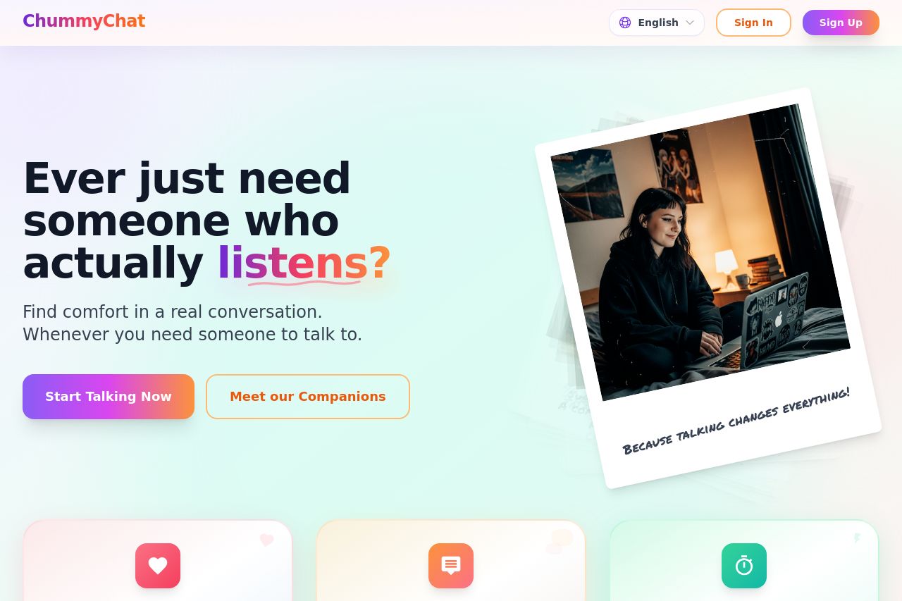
Connect with real people for meaningful audio & video chats. Honest talks, advice, and support — anytime, anywhere with ChummyChat.

Summary:
ChummyChat aims to create a friendly and inviting atmosphere for its users with a focus on meaningful connections. The website showcases an attractive design with bright, welcoming colors and a clean layout. However, there's room for improvement in defining the value proposition more clearly and tailoring the content more effectively to the target audience. Tone matches the friendly nature, but the text could be simplified for better readability. The design is cohesive, but some calls-to-action could be more prominent. Overall, a solid foundation that could benefit from clearer messaging and a bit more visual focus on important elements.
- Clarify the main value proposition in the hero section by making it more specific about what ChummyChat offers.
- Make the CTAs more action-oriented and place them where users are most likely to convert.
- Simplify the text to enhance readability and ensure content resonates more with the target audience.