wizcase.com
Landing Page Analysis
FAST - Only the fastest VPNs with full access free trials
Summary:
The landing page does a decent job of covering a broad audience looking for free VPN trials with clear titles and consistent use of branding. The color scheme is calm and professional, which aligns with the tech advice theme.
However, the text is repetitive, dull, and lacks excitement. It's all about lists and nothing stands out from the endless rows of text. The CTAs are bland, largely similar, and don't create urgency or interest. Reviewing them should be a priority.
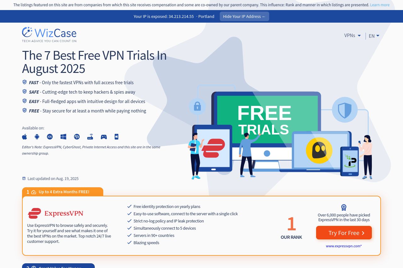
The design utilizes a safe layout, but "safe" sometimes translates to "boring." The CTA buttons do pop visually, but the rest of the information feels just thrown on the page. The icons and illustrations are decent, adding some visual relief, but they aren't making the page any more memorable or engaging.
The structure gets a moderate thumbs-up for logical flow. But, they missed opportunities for engaging visual storytelling. The transparency about rankings is appreciated, but terms like "free-trial" are overused, making it seem desperate rather than compelling. Best be more playful or persuasive for consumer engagement.
- Diversify the CTA language to create urgency or curiosity.
- Use more engaging images or examples to break text monotony.
- Improve hierarchy by varying font sizes and weights for better readability.