syncstudy.app
Landing Page Analysis
Your AI-powered study buddy. Instantly create quizzes from your documents to help you study better.
Summary:
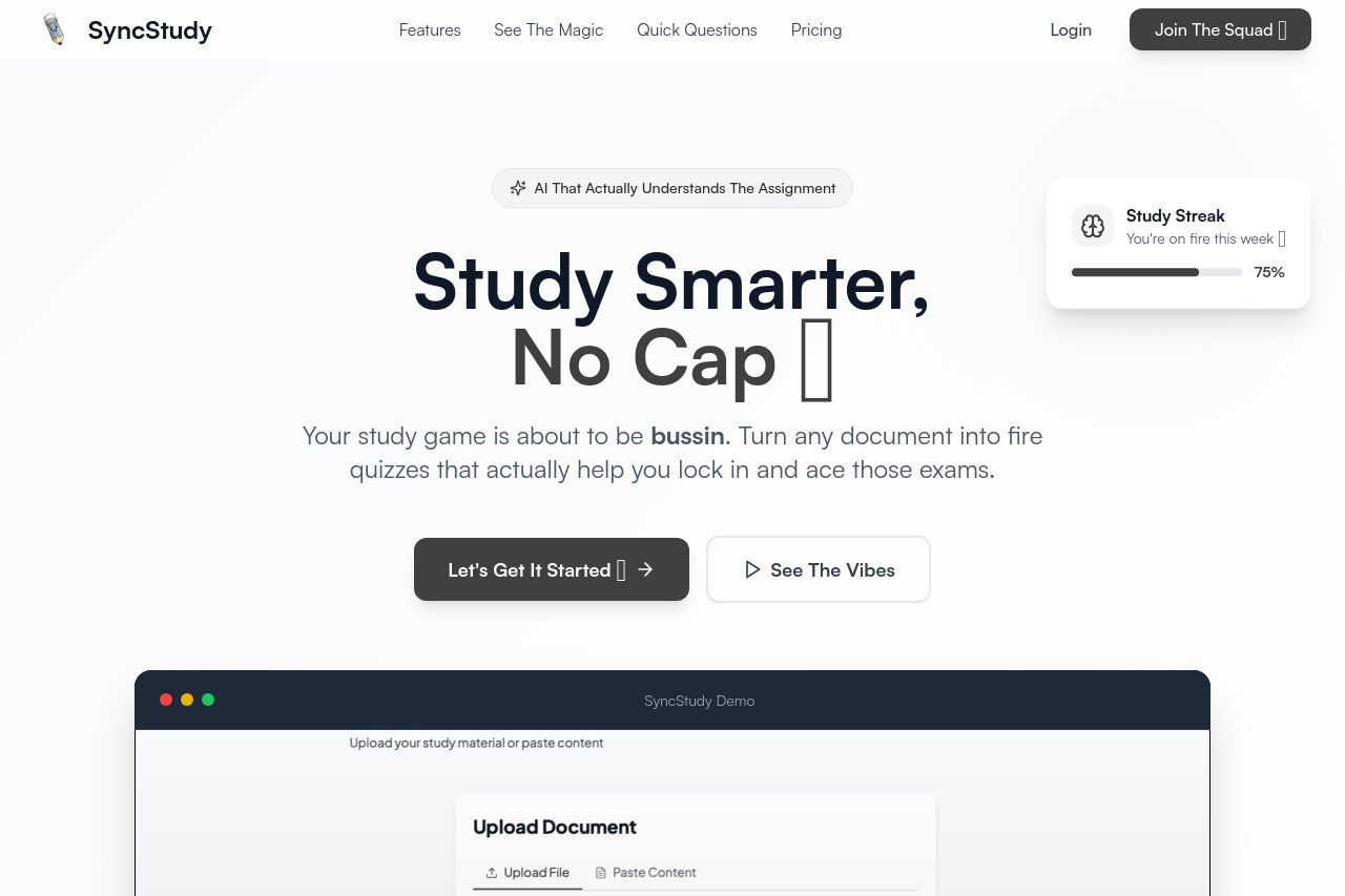
SyncStudy is trying hard to appeal to the Gen Z crowd with its informal tone and use of contemporary slang. While it makes the brand seem approachable, it can also risk alienating those who might find it too casual or unprofessional. The value proposition is not immediately apparent on the homepage, with phrases like "Study Smarter, No Cap" which may not translate to everyone. Design-wise, the site feels modern and clean, but lacks strong CTAs and visual hierarchy that guide the user's journey efficiently through its features and benefits. While the typography is clear and readable, the somewhat uniform appearance can make scanning for important information challenging. Consistency in design elements helps, but the content is too reliant on the trendy language, which could age poorly. Social proof is lacking on the main sections which might harm credibility—no recognizable logos or testimonials stand out immediately. The site's actionability is confused by CTAs that don't pop visually or through wording. Information structure is logical in some areas but jumbled in others, making it harder for users to find exactly what they need at a glance.
- Clarify the main value proposition with a clear benefit statement.
- Add social proof such as testimonials or user reviews prominently.
- Improve CTA visibility with contrast or size differentiation.