internetservicelookup.com
Landing Page Analysis
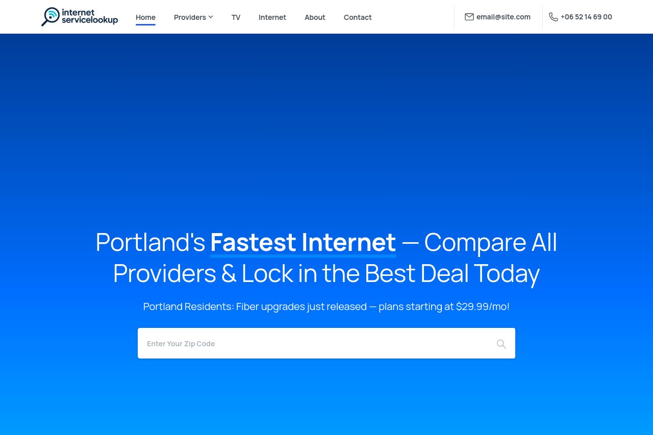
Portland Residents: Fiber upgrades just released — plans starting at $29.99/mo!
Summary:
Overall, the landing page for Internet Service Lookup has a clean design but lacks in delivering a strong, engaging, and clear message. The hierarchy and layout are visually appealing, with certain critical elements, such as CTAs, adequately highlighted. However, the messaging falls short in resonating effectively with a target audience. The main value proposition could be sharper and more specific, and some sections seem repetitive without offering fresh insights. The tone fits a professional setting but doesn't stand out. The readability is decent, but some text areas are too simplistic or generic, which might miss engaging users deeply. Design-wise, it's visually cohesive, yet there could be more dynamic elements or colors to break monotony and enhance interest. Structurally, the navigation is intuitive, and the information flow is generally logical. However, actionability is hindered by a vague CTA focus, lacking urgency or clear next steps. Credibility is well-established through trust marks and testimonials, although the contact information could be more prominent.
- Enhance the main value proposition with more specific details about the unique offerings.
- Incorporate urgency or scarcity into CTAs to increase motivation to act.
- Introduce more dynamic visual elements or contrasting colors to break monotony.