nwmedbill.com
Landing Page Analysis
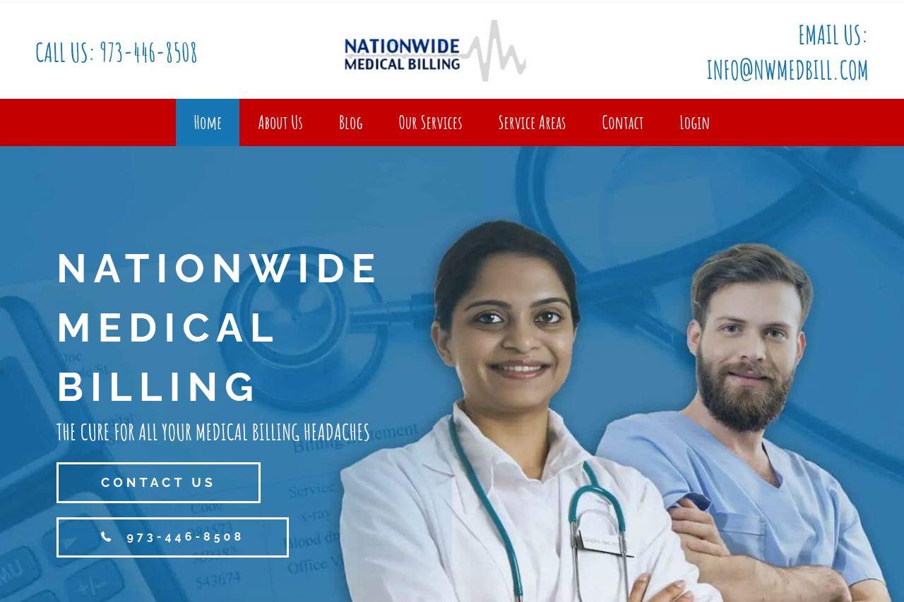
Nationwide Medical Billing The Cure For All Your Medical Billing Headaches Contact Us 973-446-8508 The way medical billing should be. Reduce your denials & Increase your volume! We thrive on getting y
Summary:
The landing page aims to present Nationwide Medical Billing as a solution to billing headaches, but falls short in several areas. The hero section is visually engaging with medical imagery and clear branding, but the main value proposition is somewhat buried under a generic tagline. The call to action, "Contact Us," is visible but lacks urgency or specificity to entice interaction. The color scheme aligns with the medical theme, yet it lacks consistency and sophistication, especially in typography. Font sizes vary widely without a clear hierarchy, which can make navigation confusing and readability poor. Social proof is evident with logos of known healthcare brands, boosting credibility, yet there are no testimonials or specific user stories that could provide a more personal touch. The overall tone feels professional but doesn't stand out. The design is clutter-free but basic; it doesn't leave a lasting impression or communicate unique selling points effectively.
- Highlight a clearer, stronger value proposition in the hero section.
- Improve typography consistency for better readability and professional appearance.
- Include testimonials or case studies for enhanced credibility.