wplace.wiki
Landing Page Analysis
Complete guide to wplace.live with helpful tools, browser extensions, automation scripts, and detailed introduction. Enhance your pixel art experience. Wplace down detector, leaderboard and news

Summary:
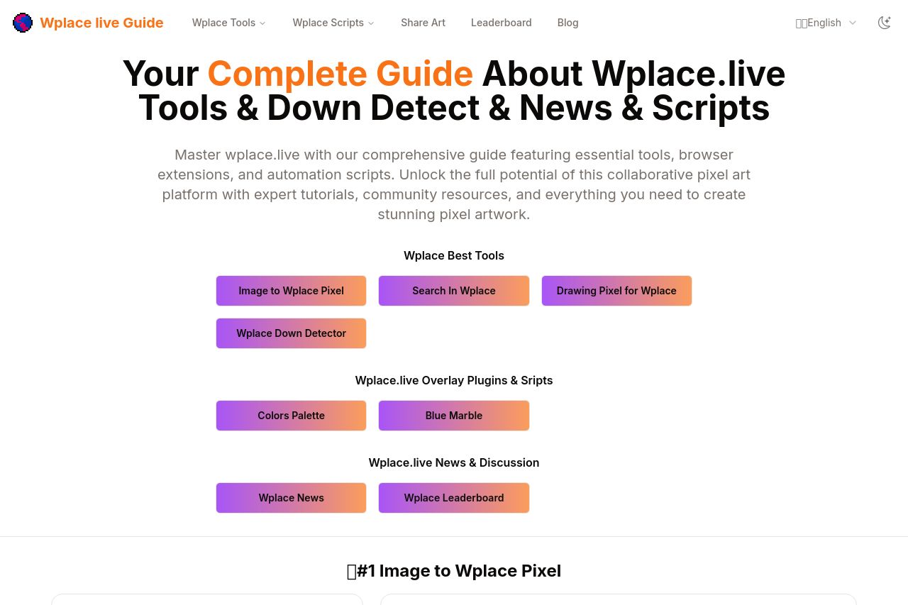
The page does a good job outlining features and tools related to the Wplace platform. However, it suffers from cluttered design and lack of clear CTA buttons that stand out. The messaging is dense, with many sections blending into one another, making it hard to quickly grasp the core offerings. The value proposition is somewhat clear, but it's buried in text-heavy sections. Visual hierarchy is lacking, resulting in a monotonous look that's easy to ignore. The color scheme is fairly unified but doesn't make important elements pop. The information flow is generally logical, yet crammed with too much detail, making it hard for users to focus on what's important. Some graphics and elements, like buttons, don't stand out enough to guide the user journey effectively.
- Simplify text and break it up into smaller, digestible sections.
- Enhance CTA visibility with contrasting colors and clear action-oriented text.
- Improve visual hierarchy by using different font sizes and weights.