findefachkraefte.de
Landing Page Analysis
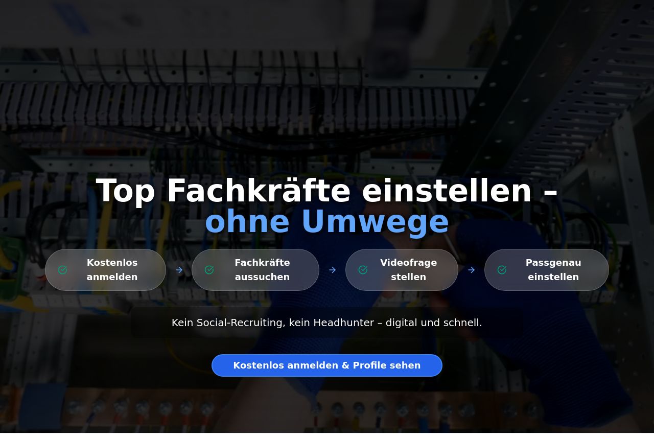
Kein Social-Recruiting, kein Headhunter – digital und schnell.
Summary:
The landing page is packed with critical information, but it suffers from design flaws and structural issues that undermine its effectiveness.
Good Points: The value propositions are clear and distinct with focused CTAs like "Kostenlos anmelden & Profile sehen". The audience is well-defined, targeting those looking to hire technical experts. The use of testimonials adds credibility, and the service benefits are clearly presented.
Areas Needing Improvement: The hero section is cluttered, with conflicting colors making the main headline blend into the background. The CTA buttons, though repeated, are not distinct enough. There's a lot of text crammed into sections without enough visual hierarchy, making it hard to digest.
Consistency is another problem, with different font sizes and weights that complicate reading. Visual elements like boxes around text are supposed to draw attention, but they often do the opposite by adding clutter. The design doesn’t adequately use whitespace, causing the page to appear cramped and busy.
In summary, clear communication is getting lost in chaotic design choices, affecting the page's readability and user engagement.
- Reduce clutter in the hero section by simplifying the design and improving color contrast.
- Make CTA buttons more distinct to ensure they stand out.
- Standardize font sizes and weights across sections for consistency.