yaqoti.com
Landing Page Analysis
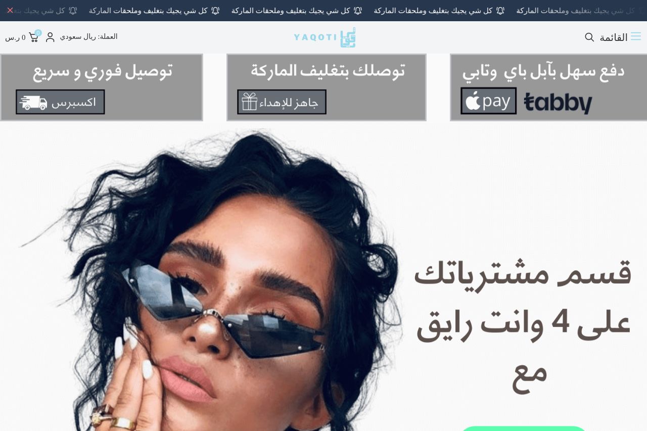
ياقوتي اونلاين اكسسوارات , سلاسل , اساور , خواتم , حلقان , نسائية و رجالية - يوجد لدينا الكثير غير ذلك - محافظ رجالية ونسائية - باقات ورود رائعة - تنسيق الطلبات وتقديمها كهدايا
Summary:
The landing page for Yaqoti is visually appealing but lacks a clear call to action. The use of high-quality images effectively showcases the products, but the text is somewhat disconnected and doesn't lead the user through a specific journey. The value proposition is scattered, and there's room for improvement in clarity and persuasion. Readability is decent, but could benefit from more concise and engaging copy. The design is consistent, but the current CTA placements don't stand out enough. There are strong elements of credibility like brand logos and contact information, but they are somewhat lost within the clutter. Overall, the page has potential but needs refinement in messaging and call to action strategy to truly shine.
- Enhance the clarity of the value proposition on the hero section to immediately communicate benefits.
- Improve CTA visibility and placement to guide users through the purchasing process.
- Simplify text and make it more engaging by focusing on benefits rather than features.
- Highlight the credibility elements more prominently to establish trust and reliability.