guidr.us
Landing Page Analysis
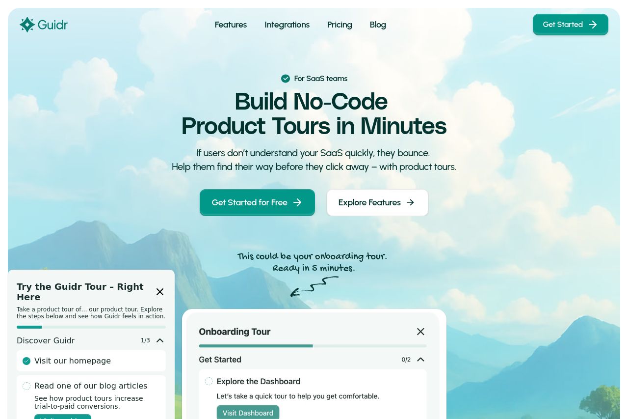
Guidr helps SaaS teams build clear, friendly product tours that guide users before they churn.
Summary:
Guidr's landing page presents a clean and professional design with a focus on simplicity and clarity, especially fitting for SaaS founders. The main value proposition—"Build No-Code Product Tours in Minutes"—is immediately clear, which is crucial. The visual identity plays on a calming mountain theme, reflecting ideas of guidance and overcoming challenges. CTAs are placed strategically but lack variety and urgency, which could be an issue for engagement. Social proof is mostly non-existent, besides some compliance badges, which doesn’t do much to instill trust. Information is generally well-structured, though some sections feel a bit repetitive, particularly when highlighting the problem customers face. The site maintains consistency in colors and fonts, enhancing the user experience visually.*
- Increase social proof with testimonials or client logos.
- Diversify CTA text to create urgency or scarcity.
- Introduce more detailed examples or case studies for clarity.