wonderskin.com
Landing Page Analysis
FREE SHIPPING OVER £35 • SPEND £50 GET FREE GIFT
73

Share on:
Summary:
60
Messaging
65
Readability
80
Structure
50
Actionability
65
Design
100
Credibility
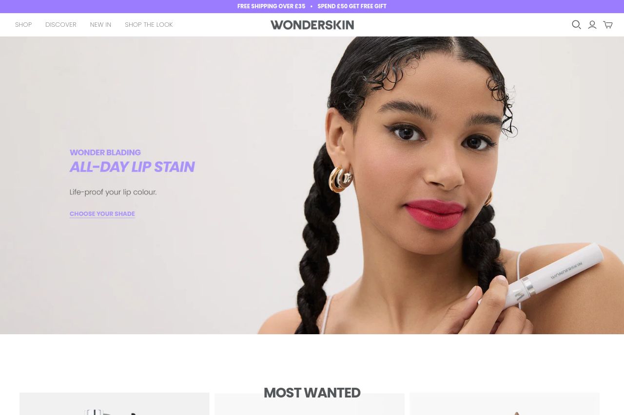
The page has a clear visual style but suffers from an overuse of pop-ups which can frustrate users. The CTA "Claim Now" is obvious but gets overshadowed by the frequent interruptions. The array of products is presented neatly, yet the color scheme, while consistent, appears somewhat overwhelming due to the intense purple. The messaging could be improved by being more direct about product benefits. Social proof is solid with multiple media features displayed, boosting credibility, but the imagery could be more diverse to captivate a broader audience. Overall, it showcases quality products but lacks subtlety and variety in engagement tactics.
Main Recommendations:
- Reduce the frequency of pop-ups to improve user experience.
- Enhance the clarity of product benefits in descriptions.
- Diversify imagery to appeal to a wider audience.