fabianspoelman.nl
Landing Page Analysis
Ontdek de AI Toolkit voor ondernemers. Met praktische voorbeelden, workflows en prompts werk je tot 10 uur per week sneller en slimmer. Direct toepasbaar!
Summary:
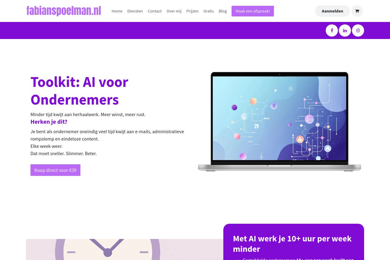
The landing page presents a clear and engaging value proposition, but several improvements could significantly increase its effectiveness. The header is professional and consistent, and the value proposition is directly stated, targeting busy entrepreneurs. Visuals such as the laptop and abstract designs support the tech-forward theme nicely. Typography and layout are simple and easy to read.
However, the design lacks a strong hierarchy and visual appeal, with overuse of purple making elements blend rather than stand out. Sections are cluttered with excessive information** without clear separation**, leading to a cluttered feel. Additionally, CTAs are not prominent enough, and headlines could be more impactful. The testimonials provide value, but their presentation lacks attention.
The structure is good, guiding the user through the content logically, but could benefit from more distinctive headlines for easier scanning. In terms of credibility, the page could enhance trust by clearly identifying the credibility of the tools being sold.
- Reduce the use of purple and introduce more color contrast to make CTAs stand out.
- Simplify sections and use bullet points for easier readability.
- Create more visual hierarchy with varied font sizes and weights.
- Improve credibility by adding more trust signals such as established client logos or certifications.