fabianspoelman.nl
Landing Page Analysis
Ontdek de AI Toolkit voor ondernemers. Met praktische voorbeelden, workflows en prompts werk je tot 10 uur per week sneller en slimmer. Direct toepasbaar!
Summary:
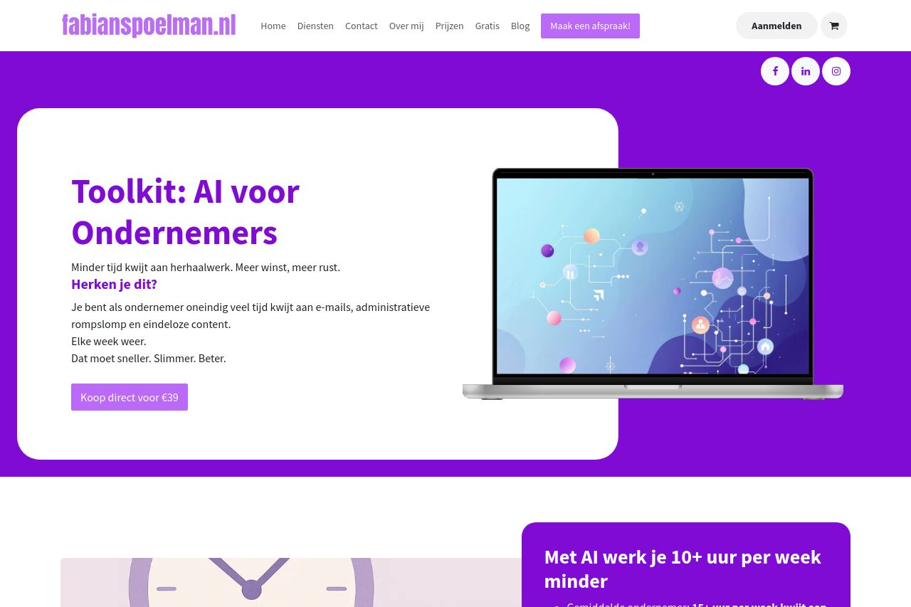
The landing page presents a clear and engaging value proposition, but several improvements could significantly increase its effectiveness. The header is professional and consistent, and the value proposition is directly stated, targeting busy entrepreneurs looking for time-saving solutions. However, the design elements feel too consistent, lacking a visual hierarchy that could guide the reader’s focus better.
The repetitive use of bright purple without sufficient contrast causes sections to blend together rather than stand out distinctly. Typography, while readable, lacks differentiation in size and weight, reducing emphasis on key points.
On a structural level, information is well-organized with clear headings, making navigation straightforward. Yet, the layout could benefit from more interactive elements or real-world examples, enhancing engagement.
CTAs are prominently placed, yet repetitious, lacking variation in phrasing to prevent them from feeling generic. In terms of credibility, the social proof is sparse, with limited testimonials and no reviews or client logos, which diminishes trust.
Overall, consistency is strong, but more dynamic design choices and varied CTAs could improve both engagement and conversion.
- Introduce more visual hierarchy by varying font sizes and weights for headings and sub-headings.
- Reduce the overwhelming use of purple by incorporating contrasting colors to help important elements stand out.
- Diversify CTAs with different languages and positions to maintain interest and encourage action.
- Add more social proof, such as client logos or a wider range of testimonials, to enhance credibility.
- Incorporate interactive elements or real-world examples to better engage visitors and showcase the toolkit's effectiveness.