scribvet.com
Landing Page Analysis
Speak naturally during exams and let our AI veterinarian scribe create detailed records for you. Simplify your practice with ScribVet.
Summary:
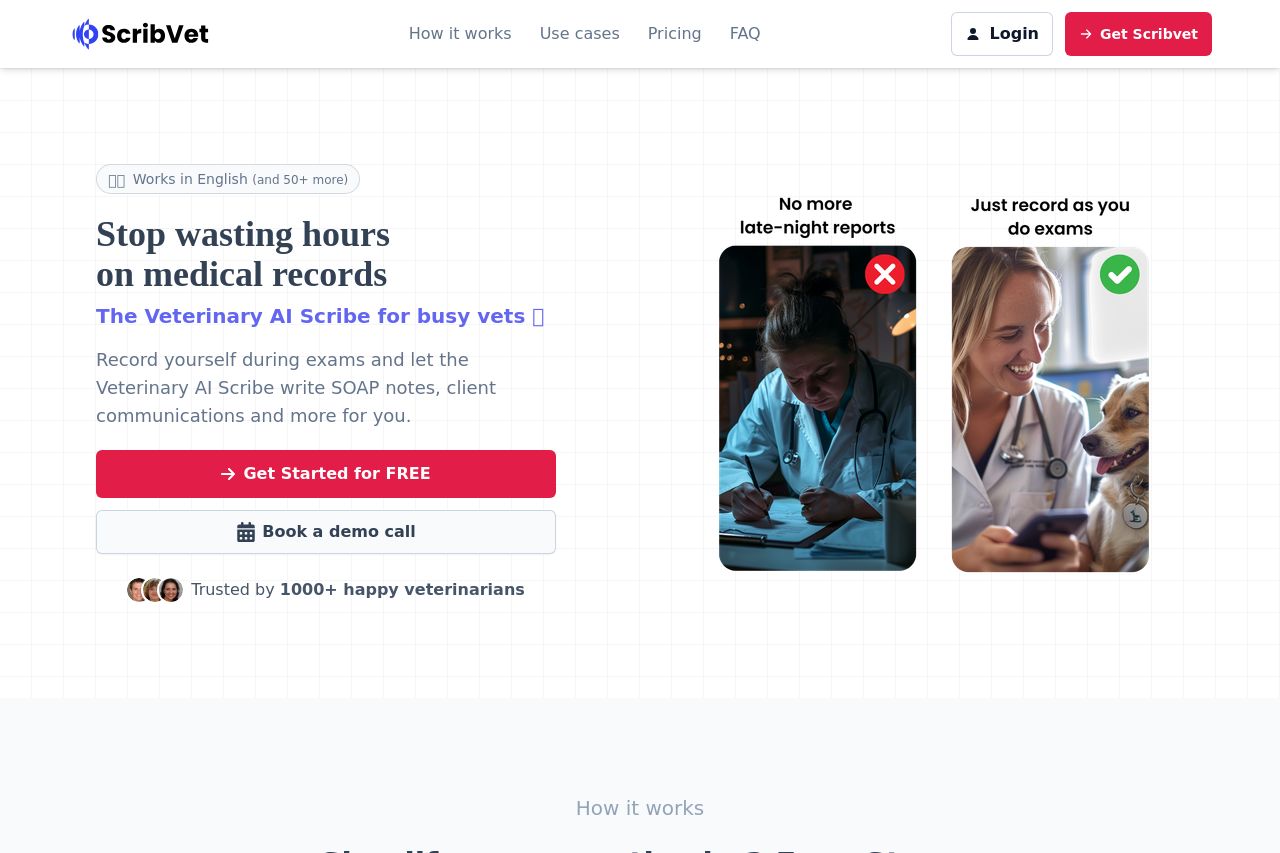
**ScribVet has crafted a landing page that effectively communicates its core value proposition, making it clear who the target audience is and what problem it solves. The phrase "Stop wasting hours on medical records" immediately addresses a common pain point for veterinarians. The visuals are engaging, with before-and-after scenarios depicted through imagery, helping users quickly grasp the benefits. However, the site falls short on consistency in visual design, with multiple sections feeling disconnected from each other. While the CTAs are frequent and stand out, their consistency could be improved. The "Get Started for FREE" button is repeated but loses effectiveness when overused. The Open Graph data has good alignment but could use more creativity to entice clicks. Overall, while the messaging is mostly clear, the design and structure show room for enhancement."
- Improve design consistency across sections for a more seamless experience.
- Enhance CTAs for better conversion rates by varying their placement and visibility.
- Revise the Open Graph image for better visual alignment and to draw more clicks.