mysteryesportsjerseys.com
Landing Page Analysis
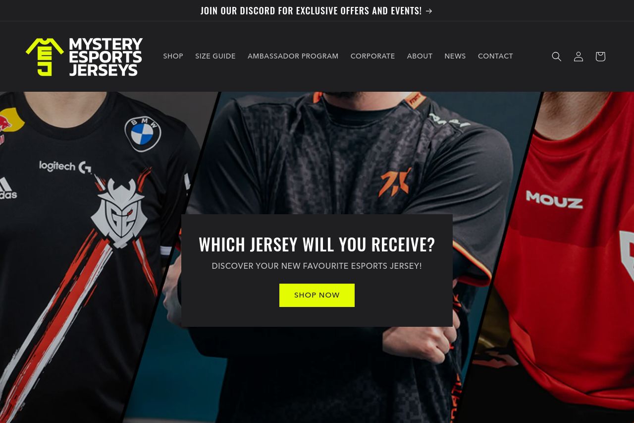
JOIN OUR DISCORD FOR EXCLUSIVE OFFERS AND EVENTS!
Summary:
Mystery Esports Jerseys' landing page makes an immediate impression with a bold, gamer-centric theme, aligning well with the target audience. However, the existing content fails to fully embrace its potential.
The hero section visually engages with jerseys from well-known esports teams, which is a massive plus. Bold colors grab attention, and the main value proposition, "Which Jersey Will You Receive?", intrigues but lacks depth in explaining the brand's unique value. More context on what differentiates these jerseys beyond simple intrigue would enhance understanding for potential buyers.
The page's readability is slightly hampered by dark backgrounds with inconsistent text contrast, sometimes making reading difficult, especially for the call-to-action section. Typography is straightforward but doesn't leverage headings and subheadings to clarify hierarchy effectively.
Design-wise, it feels cluttered at times with logos splashed at the top, which could overwhelm visitors. Consistency fluctuates, with color highlights not always matching the tone of urgency the brand tries to convey. The call-to-action (Shop Now) is visible, though it could be better complemented with information about product benefits or features.
Regarding structure, sections like "How Does It Work?" and "Let Our Customers Speak" do exist, but critical information is buried, making user navigation less intuitive than it should be. The testimonial section adds much-needed social proof but could be more robust by increasing visibility and readability. The FAQ section is a smart inclusion but visually disjointed and overly reliant on bright neon yellow.
Overall actionability is hit-and-miss. Although the CTAs are present, they're not compelling enough to drive conversions. Increasing credence through consistent design and clearer storytelling would undoubtedly uplift this site.
- Refine the main value proposition to clearly communicate the product benefits and unique selling points.
- Improve text contrast for better readability, especially against dark backgrounds.
- Reorganize the structure to make the user journey more intuitive and engaging.
- Enhance the CTA by making it more descriptive and action-oriented.
- Leverage more vivid descriptions and credibility-building elements in the testimonials.