chummychat.com
Landing Page Analysis
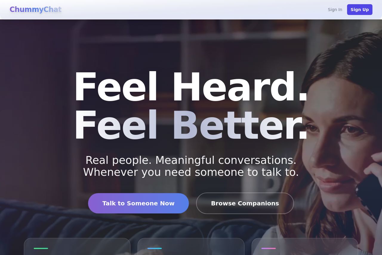
Connect with real people for meaningful audio & video chats. Honest talks, advice, and support — anytime, anywhere with ChummyChat.

Summary:
ChummyChat Landing Page Overview
The landing page for ChummyChat strikes a decent balance between clarity and usability. It benefits from a clean design that communicates its purpose—connecting people for meaningful conversations—effectively with the tagline, "Feel Heard. Feel Better." However, there's room for improvement.
The header section is strong visually, with engaging CTA buttons like "Talk to Someone Now," but it could clearly define its audience better. The "Connect in a few simple steps" section is straightforward and user-friendly, offering clear steps.
Testimonials add a human element, but the lack of detailed information or pictures of clients feels generic. There are areas where the design could elevate the message more, like making the CTAs bolder and ensuring they stand out more prominently.
The overall emotional appeal is moderate; enhancements in copy specificity and dynamic visuals could further support the uplifting theme. While the page is consistent in layout, a tad more visual hierarchy is needed in terms of contrasting text and background in some sections, enhancing readability further.
Pricing is clear, though it might benefit from emphasizing value more intensely. The FAQ section is functional but could use styling to enhance engagement. Social proof is somewhat present, thanks to testimonials, yet it could benefit from more extensive use of recognizable logos or badges to enhance credibility.
- Add more specific testimonials with pictures for authenticity.
- Enhance CTAs with stronger visuals and more explicit action verbs.
- Improve visual hierarchy with better contrast in some sections.