frontendbaba.dev
Landing Page Analysis
FrontendBaba offers free, easy-to-use frontend developer tools like CSS generators, image compressors, and more. Improve your frontend workflow today!
Summary:
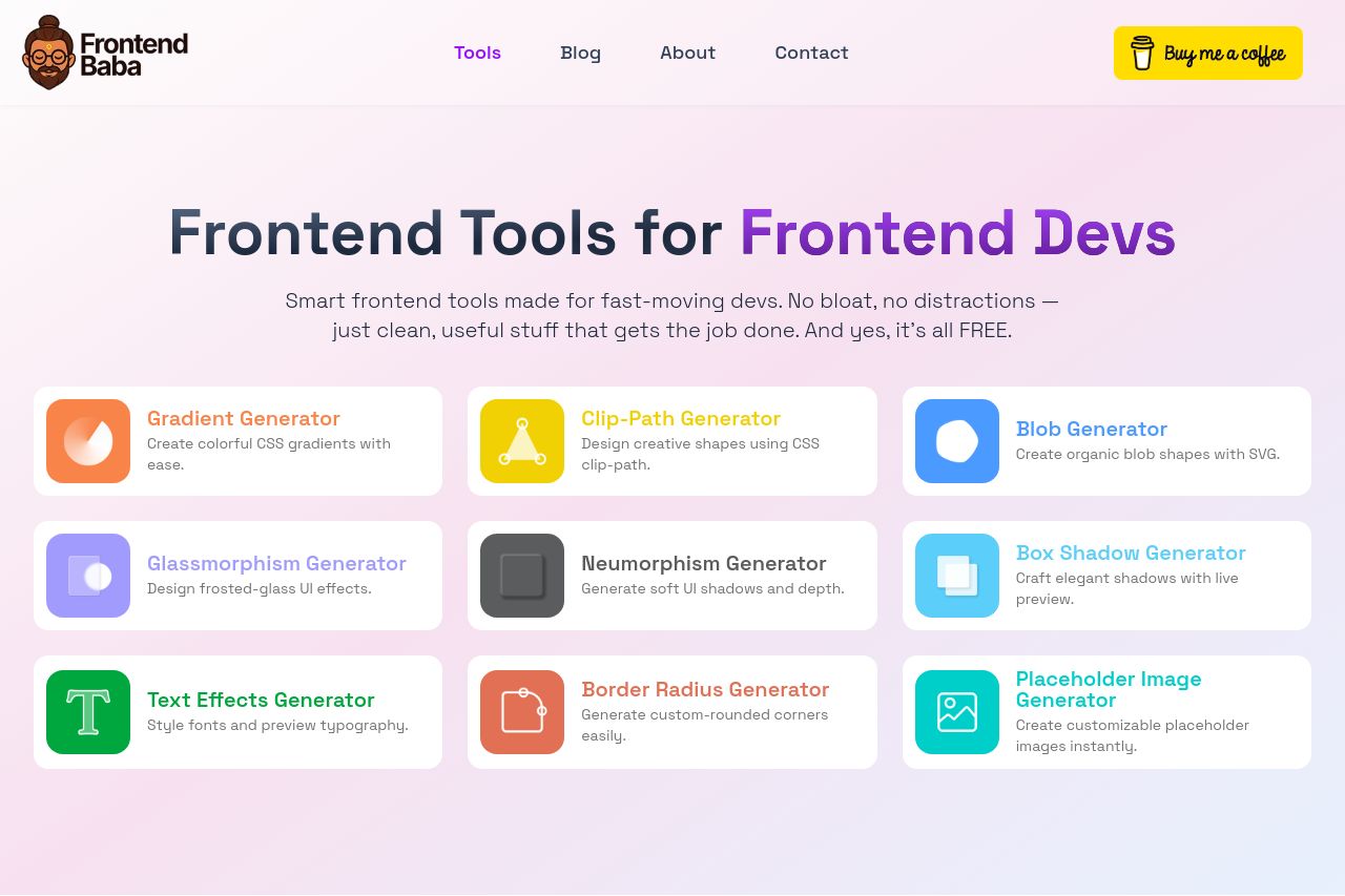
The landing page for Frontend Baba immediately communicates its intent with the bold headline, "Frontend Tools for Frontend Devs." This clarity is commendable, but lacks any unique hook or angle that differentiates it from potential competitors. The text is straightforward, which is good for comprehension, but it's peppered with words like "spark creativity" and "no clutter," which feel generic after the initial message.
Design-wise, the color palette is pleasant, but it's a bit too harmonious, leading to confusion about which section or element is the focus. The main CTAs — "Open Tool Name Generator" — are clear but repetitive, creating fatigue in the user journey. Though there are plenty of visuals, they don't engage or add value, merely illustrating a point already driven home by the text.
The layout creates an organized flow, but distinct sections seem cut from the same template, reducing engagement over scanning multiple tools with similar descriptions. Credibility is enhanced with a modest approach — everything is free, yet it feels like an afterthought rather than a benefit.
Overall, while the page does not commit glaring errors and gets its point across adequately, it lacks distinctiveness. It's safe, but safety doesn't win over discerning users looking for a competitive edge.
- Differentiate the value proposition with unique features or benefits not found in competitors.
- Incorporate more dynamic visuals that illustrate tools in action or demonstrate user benefits.
- Diversify CTA text to add urgency or specific benefits, like 'Start Creating Now' instead of 'Open Generator'.
- Align colors more strategically to highlight main actions and key features, making important information pop.