landinganalyze.com
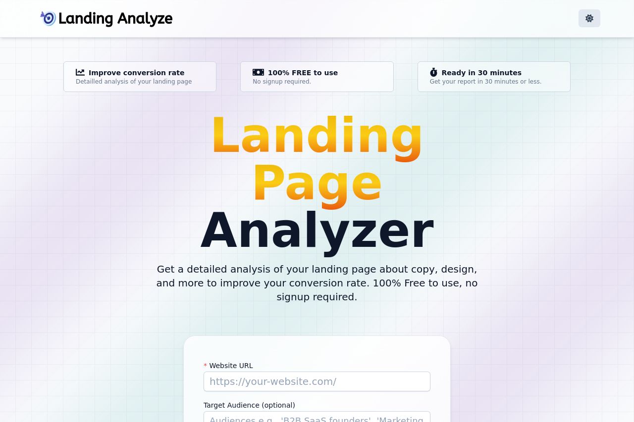
Landing Page Analysis
Get a detailed analysis of your landing page about copy, design, and more to improve your conversion rate. 100% Free to use, no signup required.
Summary:
Landing Analyze does a lot of things right with its landing page, but there's room for improvement.
Good Points: The main value proposition is clear, emphasizing free, no-signup analysis. The typography is clear and easy to read, with no overwhelming technical jargon present. The use of color and contrast makes important elements, like CTAs, stand out enough.
Bad Points: The value proposition could use more repetition to really drill the benefits home. While there’s an attempt to address B2B SaaS founders specifically, it feels generic at times. The design doesn't effectively use whitespace to separate elements, leading to a cluttered feel. The lack of strong credibility elements like client logos or detailed testimonials doesn’t build strong trust. CTAs, while visible, don’t convey a sense of urgency or compel immediate action as effectively as they could.
- Add more specific use cases or examples tailored for B2B SaaS founders.
- Include trust-building elements like testimonials or client logos.
- Improve CTA copy to create urgency or action-oriented directives.