juhhe.hu
Landing Page Analysis
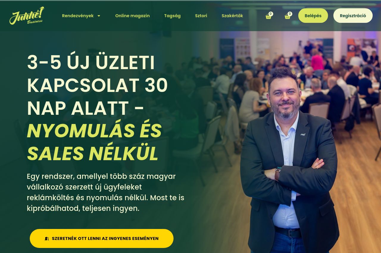
Egy rendszer, amellyel több száz magyar vállalkozó szerzett új ügyfeleket reklámköltés és nyomulás nélkül. Most te is kipróbálhatod, teljesen ingyen.
Summary:
The landing page does a decent job of presenting its value proposition, appealing to Hungarian entrepreneurs with an enticing offer to create business connections without aggressive sales tactics.
The structure is logical, but text-heavy sections overwhelm and might lose readers' interest quickly. The use of consistent color schemes helps maintain visual cohesion, though some elements become hard to differentiate due to similar sizes and weights.
The CTAs are numerous and strategically placed, but they could benefit from more compelling, varied text to increase engagement. Credibility is established with testimonials and a professional look, despite feeling slightly crowded at times.
- Simplify the text to make it more digestible.
- Enhance CTA texts to be more specific and engaging.
- Improve visual hierarchy to make the content more scannable.