svarnainstitute.com
Landing Page Analysis
04388 2708
76

Generated on:
August 17, 2025Score:
76/100Share on:
Summary:
80
Messaging
70
Readability
85
Structure
40
Actionability
65
Design
95
Credibility
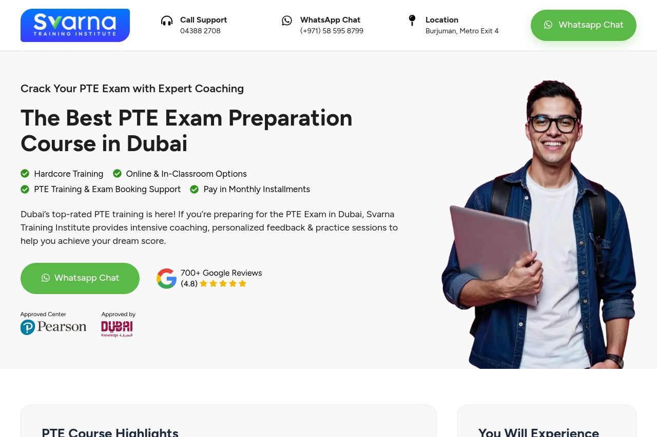
The page does a decent job of conveying the main benefits and features of the PTE courses, with a clear focus on expert coaching, flexibility, and location.
However, the design feels cluttered in some areas, particularly around the testimonial and course options sections. The continuous use of WhatsApp chat buttons every few scrolls seems excessive and can be distracting rather than helpful.
The call to action is repetitive but doesn't stand out due to lack of contrast, making it easy to overlook. Social proof is visible, but the testimonials could be more prominent.
Overall, while the page has a lot of good information, the presentation could be refined and the actions made more obvious.
Main Recommendations:
- Reduce the number of WhatsApp chat buttons to avoid clutter.
- Improve the contrast for CTAs to make them more noticeable.
- Streamline the design for consistency and reduce visual clutter in sections like testimonials and course options.