aarna.ai
Landing Page Analysis
leverage yield aggregation, ai-quant vaults, and fully onchain portfolio execution with aarnâ tokenized vaults
Summary:
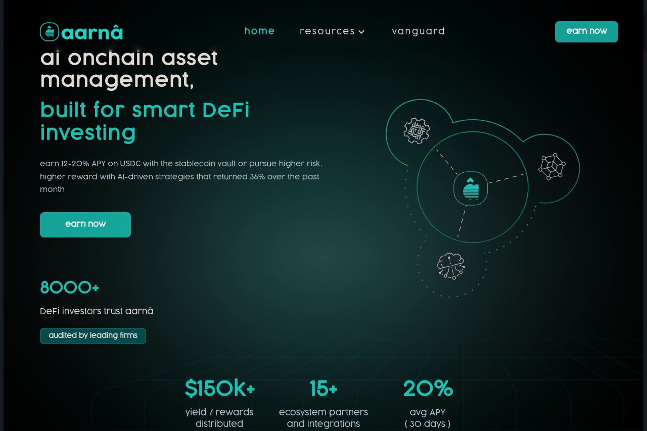
Strong opening with specific promises like "built for smart DeFi investing". However, the overall messaging feels cluttered with financial jargon that might alienate newcomers.
The design uses a consistent color palette that fits the crypto theme but lacks visual pop, making it feel monotonous and flat. The CTAs have decent prominence but don't evoke urgency or action-driven responses.
Good inclusion of social proof with metrics and partnerships, but the credibility section needs more depth in conveying trust signals.
The layout somewhat follows logical flow, though some areas, like the token announcements, could benefit from being more visually distinct.
Ultimately, a well-structured design struggling under heavy jargon and too much on a single tone/visual scheme.
- Simplify language to appeal to a broader audience
- Increase visual diversity with contrasting elements or highlights
- Consider adding personalized testimonials or case studies