mrbdexpert.com
Landing Page Analysis
Take your business to the next level with MRBD Expert cutting-edge insights and personalized marketing services for real results
Summary:
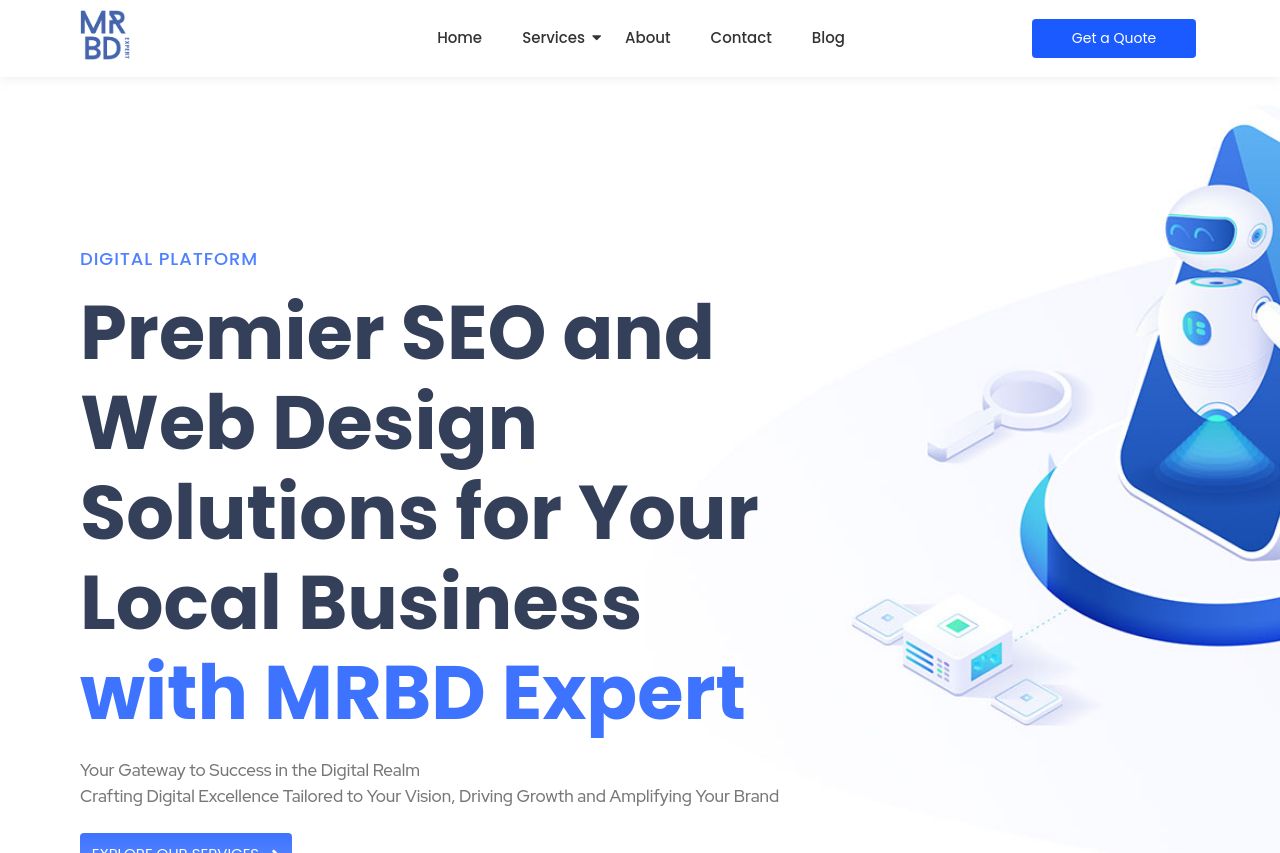
Definitely a mixed bag here. The hero section starts strong with a clear value proposition, but it could do more to engage with more descriptive language. The design is clean but borders on sterile—the typical blue and white isn't exactly memorable. The services section boasts a clear hierarchy but gets bogged down by overly verbose descriptions. Why spoon-feed when you can communicate impact in fewer words?
Social proof exists, but the use of generic logos and lorem ipsum detracts from credibility. The testimonials need to pop more visually to lend actual authenticity. The CTA buttons are tucked here and there, but they don't scream "click me" in engagement metrics parlance. The blog section is a solid idea, but the engagement is likely low without a more captivating lead-in. Overall, professional but conservative—safe but far from remarkable.
- Clarify the unique value proposition in more engaging terms.
- Streamline text in the services section for readability.
- Make the CTAs stand out visually—bigger, brighter, more enticing.