zakovsky.sk
Landing Page Analysis
Predajca záhradnej techniky ŽÁKOVSKÝ. Kvalitné náradie do dielne a na stavbu. Veľký výber záhradnej techniky rôznych značiek.
Summary:
The landing page of ŽÁKOVSKÝ is a mixed bag of professional elements and areas needing improvement.
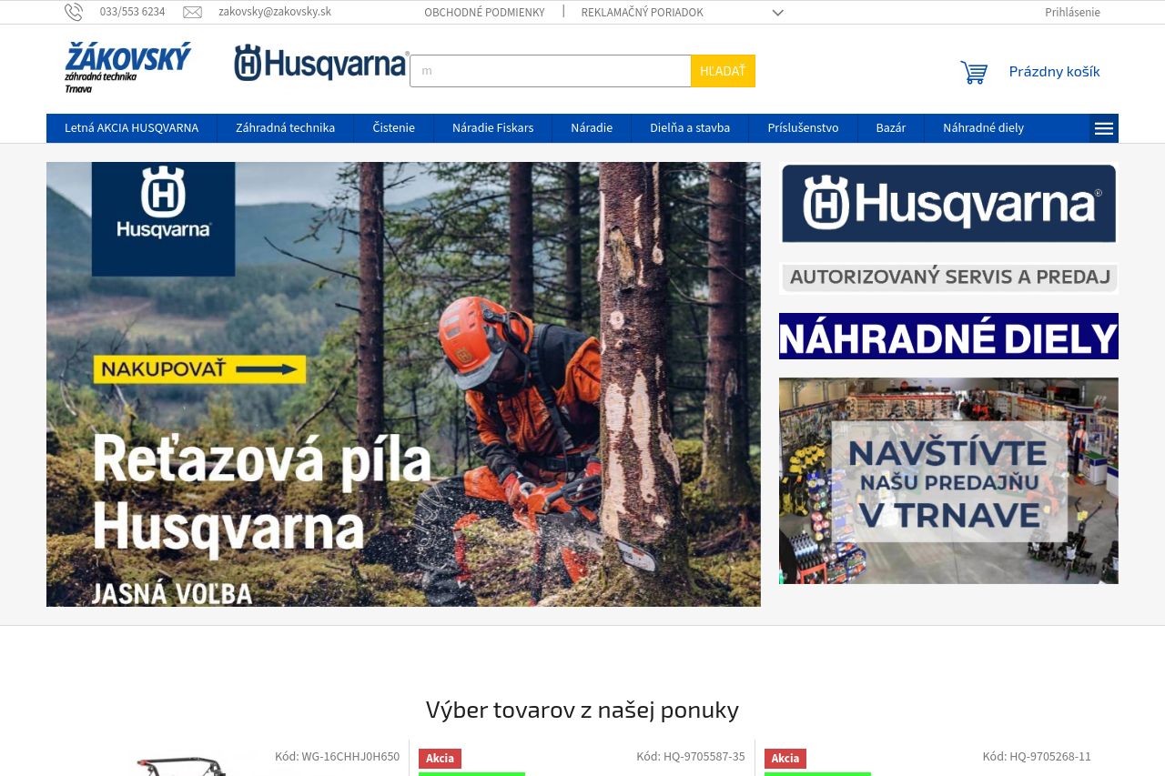
The hero section succeeds in immediately providing a clear call-to-action with a bright yellow "NAKUPOVAŤ" button. However, the visuals become cluttered with a large amount of text and images on display, competing for attention. The page does a decent job of displaying product availability and relevant information, yet suffers from distracting cookie consent banners repeatedly interrupting the shopping experience. Consistency and trust elements are strong due to clear contact details and identifiable partnerships with known brands like Husqvarna. Yet, navigating product categories feels overwhelming due to a lack of clear structured organization and differentiation with headings, making browsing a chore rather than the intuitive process it should be. Overall aesthetic and usability require enhancement as clutter detracts from usability, while imagery supports product detail well, but can sometimes overwhelm. Design consistency is mostly maintained, but subtle enhancements can modernize the page to better appeal to todays users.
- Reduce clutter by organizing products into clearer categories with distinct headings.
- Streamline the cookie consent experience to reduce interruptions.
- Enhance visual hierarchy using more defined typography and weight differentiation.