dynamiqr.nl
Landing Page Analysis
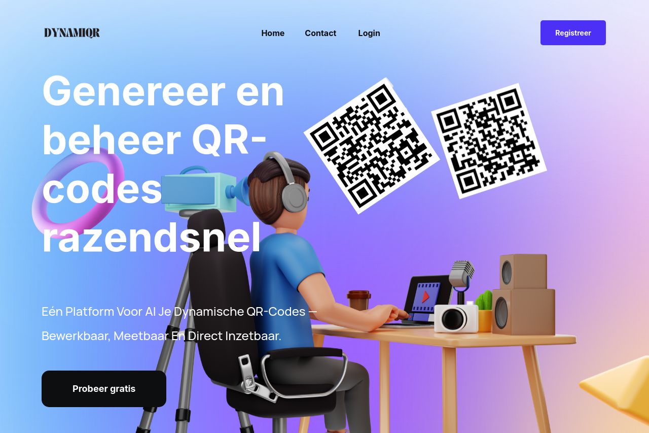
Eén platform voor al je dynamische QR-codes — bewerkbaar, meetbaar en direct inzetbaar.
Summary:
Overall, the page has a modern design but is plagued by a disconnect between visual appeal and strategic messaging.
The hero section strongly captures attention with vibrant colors and 3D illustrations. However, the value proposition is not powerful or unique enough to stand out in the competitive space.
The messaging throughout is generic and lacks specificity, making it hard for potential clients to understand unique benefits. The audience isn’t clearly defined; terms like "QR codes razendsnel" and "Eén Platform Voor Al Je Dynamische QR-Codes" are vague and do not speak directly to pain points of potential users.
There’s an over-reliance on placeholder images which disrupts the professional feel and breaks trust. Whitespace helps with readability, but the continuity between sections is poor, creating a fragmented user experience.
Consistency is another issue, with CTAs and headings appearing inconsistent in color and placement. CTAs get lost amid the noise—placement and wording need immediate attention. The use of logos from 700+ companies is a positive move, but it’s quickly overshadowed by generic design and lack of distinctive brand voice.
- Define a stronger and clearer value proposition that addresses specific benefits of using the platform.
- Replace placeholder images with real product visuals to build credibility.
- Use consistent CTA styles and ensure they stand out more against the background.
- Make better use of whitespace by not only avoiding clutter but also grouping information logically.
- Tailor the messaging to a specific audience, addressing their needs and pain points directly.