orderease.nl
Landing Page Analysis
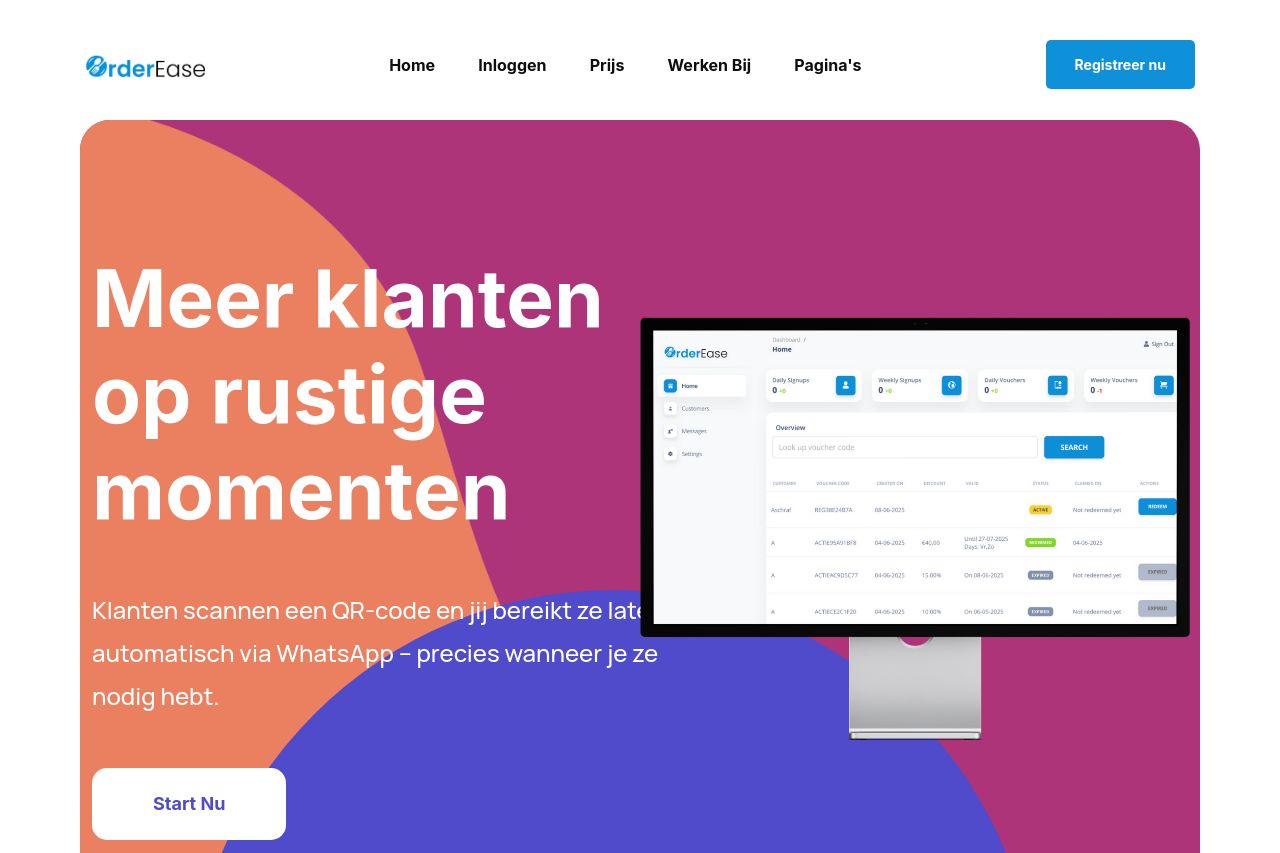
Klanten scannen een QR-code en jij bereikt ze later automatisch via WhatsApp – precies wanneer je ze nodig hebt.

Summary:
The landing page for OrderEase seems to provide clear value propositions for attracting customers during quiet moments in the restaurant industry. However, some sections feel scattered and lack cohesive flow, which could be detrimental to user engagement. The color scheme is consistent but borders on being overwhelming with its bright hues. The messaging could be a bit more targeted towards the specific audience it is trying to reach. Call-to-Action (CTA) placements could be improved for better user guidance. Though testimonials are present, they need to be more visually appealing and accessible. The open graph data is missing, which doesn't help in sharing or promoting the page on social media platforms.
- Improve the flow between sections to maintain user engagement.
- Refine CTAs to be more strategically placed throughout the page.
- Enhance testimonials with visuals or more compelling content.