lansky.tech
Landing Page Analysis
Web development done right.
Summary:
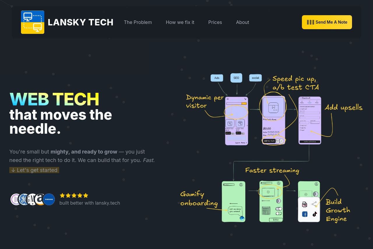
The landing page for Lansky Tech has a visually engaging design but suffers from some clarity issues in messaging. While the design is generally cohesive, with appealing use of colors and fonts aligned with the tech theme, the messaging could be clearer. The value proposition, 'WEB TECH that moves the needle,' is catchy but lacks specificity. There's an attempt to explain what they offer, but it's somewhat generic and could benefit from clearer distinctions or more concrete examples. The CTA, 'Send Me A Note,' is visible, yet it could be more action-oriented. The testimonials add credibility, and the founder's presence builds trust, yet it misses clear social proof such as recognizable logos or endorsements. The focus on potential problems like tech project failures aligns well with the target audience, but the content could do a better job tailoring the message to potential customers. The typography supports readability, but the layout can get cluttered at times, especially in text-heavy sections. The overall use of visuals is appealing and supports the tech-savvy image. However, the sequence of information feels a bit disjointed, requiring users to scroll and decipher the narrative flow.
- Clarify the value proposition with more specific examples.
- Enhance CTA text to be more action-driven, such as 'Start Your Project Today.'
- Streamline content flow to ensure smoother navigation between sections.