norton.com
Landing Page Analysis
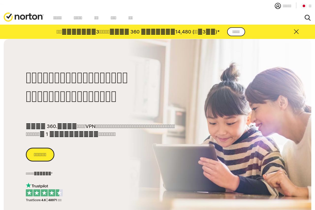
Windows/Mac/スマートフォンの保護、個人情報流出を検知・各種問題を解決するための最新の技術が搭載されたノートン製品の詳細説明と販売を行っています
75
Generated on:
August 15, 2025Score:
75/100Share on:
Summary:
70
Messaging
50
Readability
75
Structure
70
Actionability
70
Design
95
Credibility
The landing page presents a solid display of its offerings with clear emphasis on product pricing and trust elements. However, the actual content delivery suffers due to poor textual clarity, which is crucial for informing and converting visitors. The use of recognizable trust badges and a clean layout speaks to credibility and professionalism. Overall design is consistent, though somewhat bland, and visuals align with the brand image. Readability is hampered by over-reliance on blocky text elements and a lack of engaging stories or benefits, which could better capture the audience's attention.
Main Recommendations:
- Simplify and clarify text elements for better readability
- Introduce more engaging content and benefit-focused language
- Enhance the visual distinction between different CTAs