launchdirectories.com
Landing Page Analysis
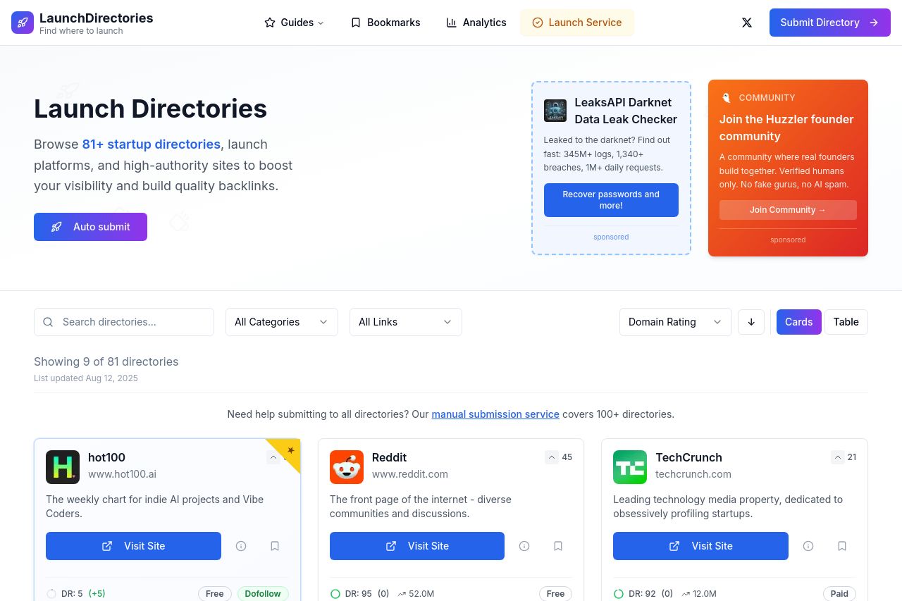
Browse curated startup directories, launch platforms, and high-authority sites to boost your visibility and build quality backlinks.

Summary:
LaunchDirectories landing page gives off strong first impressions with a clean design and useful layout. The main value proposition "Browse 81+ startup directories" is upfront, but it lacks strong differentiation or an immediate emotional appeal to truly engage the target audience of startup founders and indie hackers. The messaging is somewhat generic, with more emphasis needed on unique benefits and success stories.
The readability is mostly good, but some text could benefit from greater simplification and breaking up longer paragraphs to maintain engagement. Visually, the page uses color well but could improve in the use of hierarchy to better guide the reader's eye. CTA placements are frequent and prominent, but there's room for improvement to add urgency or uniqueness.
While the site has well-organized sections, there's a need for more compelling storytelling or direct imagery to draw interest. Credibility is helped by recognizable review sites and a somewhat professional look, though adding more community ties or testimonials could bolster this further. Overall, it's a solid foundation, needing a bit more flair and audience-focused detail.
- Enhance the value proposition with more compelling and audience-specific benefits.
- Improve CTA text to create urgency or exclusivity.
- Introduce more customer testimonials or stories for increased credibility.