leanebiome.com
Landing Page Analysis
Leanbiome® is the official USA probiotic and fat burner supplement. Promote gut health, burn fat, and support your weight loss journey. Order now!
Summary:
The LeanBiome landing page does a decent job at conveying its probiotic benefits, but it falls short in a few critical areas.
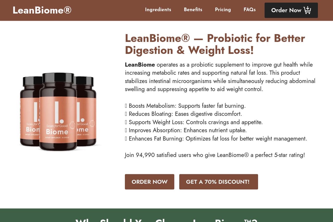
The hero section attempts to quickly communicate the product's core benefits, but it feels cluttered with text and lacks a strong, standalone value proposition. The numerous benefits listed blend into one another without being distinctly prioritized or highlighted.
Design-wise, there's a consistent use of color and typography, though some text could use more contrast to improve readability. The header has a professional look, but the design comes across as slightly dated, and the call-to-actions, although clear, could stand out more.
Structural clarity and the navigation through headings are executed well enough for users to understand the purpose of the site without confusion. However, the order of information like ingredients tends to repeat unnecessarily, which can be tedious.
The credibility section is strong, with trust badges and testimonials enhancing the brand's reliability. However, the design feels a bit like it's trying too hard with repetitive elements.
Overall, while the landing page achieves its basic goals, it could benefit from simplifying its messaging, enhancing design elements, and improving actionability to ensure a seamless user journey.
- Simplify and clarify the main value proposition in the hero section.
- Increase the contrast of CTA buttons to make them more prominent.
- Streamline text to avoid redundancy, especially in the benefits and ingredients areas.