webinfomatrix.com
Landing Page Analysis
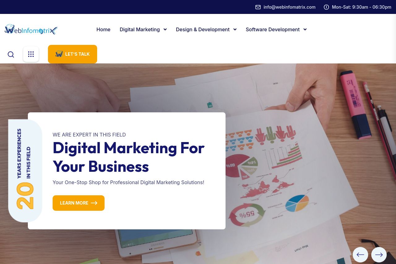
Rated # 1 Digital Marketing, Website Designing, Development and SEO Company in India that provides Best Web Development, SEM, SMO and SEO Services across the world.

Summary:
The landing page attempts to portray authority in digital marketing and web development but falls short in making a strong impact.
The value proposition is scattered, lacking specificity in its messaging. While it does communicate a broad promise of expertise in digital marketing and software development, the benefits and features are vaguely presented. The audience isn't specifically addressed, making it seem too generic.
Readability stumbles over some design choices. The typography is quite standard, ensuring ease of reading, but long blocks of text reduce engagement. The contrast between text and background is okay, yet the excessive uniformity in font color drops the visual hierarchy.
Design consistency sees both ups and downs. Consistent color themes and font usage create a sense of cohesion. However, the visual hierarchy is weak, as the same font sizes and colors are used across different sections.
Structure is quite decent but lacks some depth. Sections are logically ordered but could employ more focus on engaging call-to-action elements. Essential content, like specific services breakdowns and unique selling points, feel buried under layers of generic information.
Actionability is the weakest link. Multiple CTAs are present, but their relevance and placement fall flat. They blend with the text rather than standing out.
Credibility leans on industry affiliations but is helped by social proof like testimonials. Overall, familiarity with the company adds to its trustworthiness.
- Define a specific audience and tailor the content to them, using clearer use cases.
- Improve visual hierarchy by varying font sizes and colors to distinguish important elements.
- Strengthen call-to-action buttons by making them more prominent and action-oriented.