pages.report
Landing Page Analysis
Copy proven design patterns from 110+ high-converting landing pages. Get the exact blueprints that convert visitors into customers — and impress your clients.
Summary:
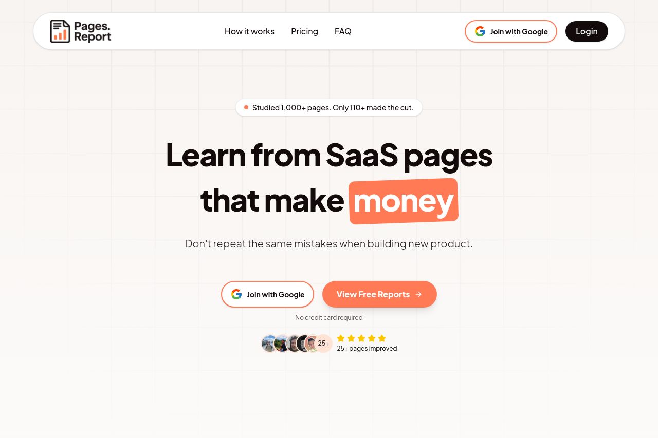
Overall, the landing page has a strong focus on SaaS page optimization with clear messaging and actionable insights. The value proposition is direct: learning from high-converting SaaS pages, but there are moments where it feels a bit too generic, lacking deeper personalization or specifics on what makes these pages special.
Design-wise, the visual hierarchy is well-managed, with crucial elements like CTAs standing out, although some sections feel repetitive in style.
The use of social proof is excellent, with testimonials and recognizable figures contributing to credibility. However, its consistent emphasis becomes a bit overwhelming without breaking it up with other engaging elements.
Actionability is mixed— CTAs are clear but could benefit from varied placements or wording to maintain interest across the page.
On the structure side, information is logically ordered, but the frequent repetition of similar testimonials and reports makes it feel a little cluttered by the end.
Readability is decent, though at times the font consistency blurs together, hindering newer text elements from popping out.
Overall, the page is sharply focused but lacks a bit of variability and personalization to make it fully engaging.
- Personalize value propositions for different user segments.
- Introduce varied CTA wording and placement throughout the page.
- Diversify visual content to break repetition and maintain engagement.