barriegate.com
Landing Page Analysis
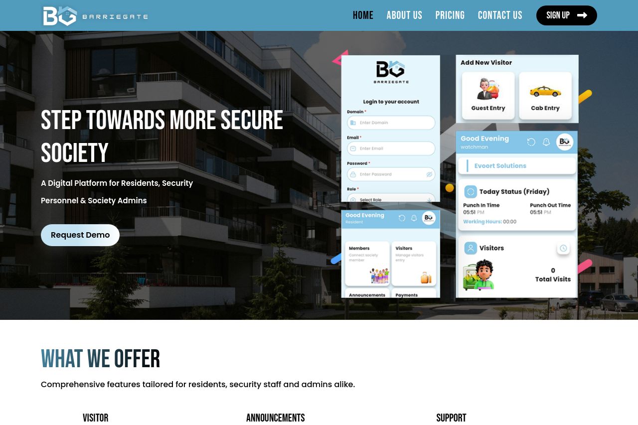
A Digital Platform for Residents, Security Personnel & Society Admins
Summary:
The page effectively communicates its offerings with clear sections dedicated to features for residents and admins. The imagery and layout align nicely with the content, supporting the message of security and connectivity. The typography is clean and legible, but some headings could benefit from more contrast to enhance visual hierarchy. The CTAs are visible and action-oriented, like "Request Demo" and "Download Our App Now!". However, there's a lack of urgency that could be infused into the CTAs to boost conversions. Social proof is minimal, and adding testimonials or reviews could enhance credibility. Overall, the design feels somewhat plain and could benefit from more dynamic elements to capture attention.
- Enhance CTA urgency with phrases like 'Limited Slots Available'.
- Add testimonials to boost social proof.
- Increase contrast in headings for better visual hierarchy.