glenisgassmann.com
Landing Page Analysis
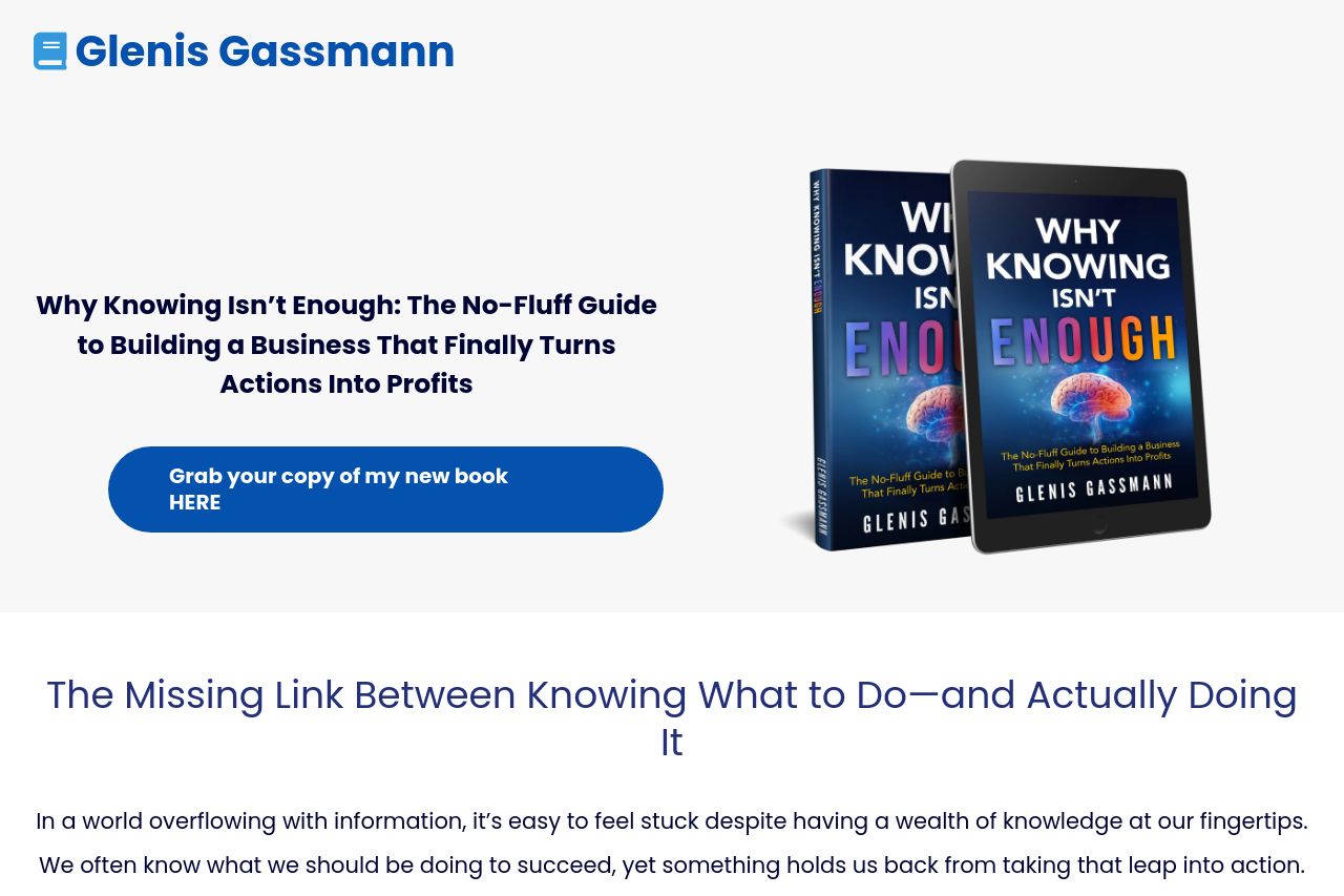
Why Knowing Isn’t Enough: The No-Fluff Guide to Building a Business That Finally Turns Actions Into Profits
Summary:
Overall, the landing page is clean but rather generic. The main headline is direct and gives an impression of what to expect, but lacks a strong hook to instantly grab attention. The text is straightforward, but the sections feel a bit long and could be more concise. Visually, the page keeps a consistent color scheme and typography, which aids readability, though the blue is too flat to create any emotional connection or urgency.
Social proof is established well with testimonials, although they could be showcased more dynamically. The call to action is clear but not very attention-grabbing. It blends into the page rather than jumping out at the user. Structurally, the page flows logically, but doesn't particularly captivate. Overall, it's a solid foundation that needs more personality to truly shine.
- Enhance the main headline with a more engaging hook to draw readers in.
- Add more visuals or graphic elements to create interest and break up text-heavy sections.
- Spice up the CTA design and placement to make it more attention-grabbing.