trendshunt.net
Landing Page Analysis
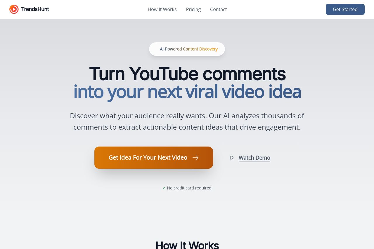
Discover what your audience really wants. Our AI analyzes thousands of comments to extract actionable content ideas that drive engagement.
Summary:
TrendsHunt's landing page does a solid job of presenting its unique value proposition. By tapping into AI-powered content discovery, it clearly highlights the convenience of extracting YouTube comments into constructive content ideas. The hero section manages to pull readers in with a strong headline and well-placed CTAs. However, the design could benefit from stronger visual hierarchy and more engaging imagery. The typography is easy to read, though some areas lack contrast. Pricing information is well-structured but could use more emphasis on unique selling points to different buyer personas. Overall, while the messaging is clear, it could resonate more strongly with emotional triggers for content creators, pushing them to act faster. The page needs a boost in credibility features like testimonials or user reviews, which could enhance trust.
- Improve visual hierarchy with stronger use of color contrast to highlight key sections.
- Integrate user testimonials or reviews to build trust and credibility.
- Enhance call-to-action buttons by making them more visually distinct and compelling.