eshrms.com
Landing Page Analysis
Optimize your HR operations with ESHRMS. Our comprehensive platform offers seamless self-service portals, intelligent attendance tracking, mobile accessibility, and secure document management to e
Summary:
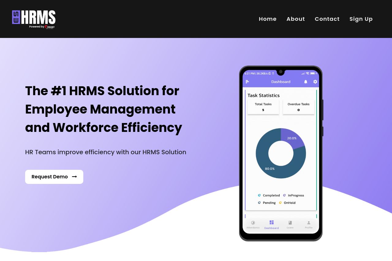
Overall, the landing page for ESHRMS has a professional design with a cohesive color scheme and consistent layout throughout the sections. However, it suffers from unclear messaging about the unique value proposition it offers. The hero section, though visually appealing, uses broad statements like "#1 HRMS Solution," which lack specificity and don't convey what differentiates it from competitors. Anytime phrases like "Effortless HR Management" could mean anything in the industry, leading to a generic feel. The readability is decent due to good typography but could be improved by breaking up longer sections for better clarity and flow. CTAs are present but often fail to stand out due to a lack of emphasis, and some are placed inconspicuously. Social proof elements, such as testimonials or recognizable logos, are missing, which weakens the credibility.
- Define the unique value proposition more clearly and specifically explain what sets ESHRMS apart.
- Add social proof elements such as testimonials or client logos to build credibility.
- Improve CTA visibility by using contrasting colors or larger buttons.