ac.uk
Landing Page Analysis
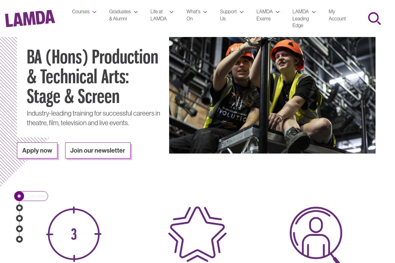
Industry-leading training for successful careers in theatre, film, television and live events.
Summary:
The page does a decent job at introducing the course with clear headlines and structured sections. However, it's a mess when it comes to clarity and focus. The design feels overly simplistic, relying too much on basic typography and generic layouts. Key details like the "Apply Now" button are easily lost because they don’t stand out. The layout isn't engaging, with too much text in places and underwhelming graphics. The absence of compelling visuals or striking imagery makes the content blend into a wall of text, failing to capture the youthful audience it targets. It’s as if they expect students to be enamored by blocks of uninterrupted text! Calls to action are scattered and lack urgency. The FAQ section tries to help but ends up as a mundane text list. There's a missed opportunity to leverage testimonials or real student stories to build trust.
- Use more engaging visuals and imagery to break up text-heavy sections.
- Highlight CTAs like "Apply Now" to make them more prominent and urgent.
- Incorporate testimonials or student stories to build credibility and connection.