joint-genesis-us.us
Landing Page Analysis
Joint Genesis™ USA: 100% natural supplement for joint health & arthritis relief. Support mobility, reduce pain, and improve comfort naturally. Order now!
Summary:
The landing page for Joint Genesis is visually engaging and packed with information, but it suffers from a lack of concise messaging and excessive text blocks.
The product's value proposition is stated throughout the page, claiming to improve joint health, mobility, and pain relief, but it repeats excessively without substantial new information. This could lead to user fatigue as they scroll through heavy text sections.
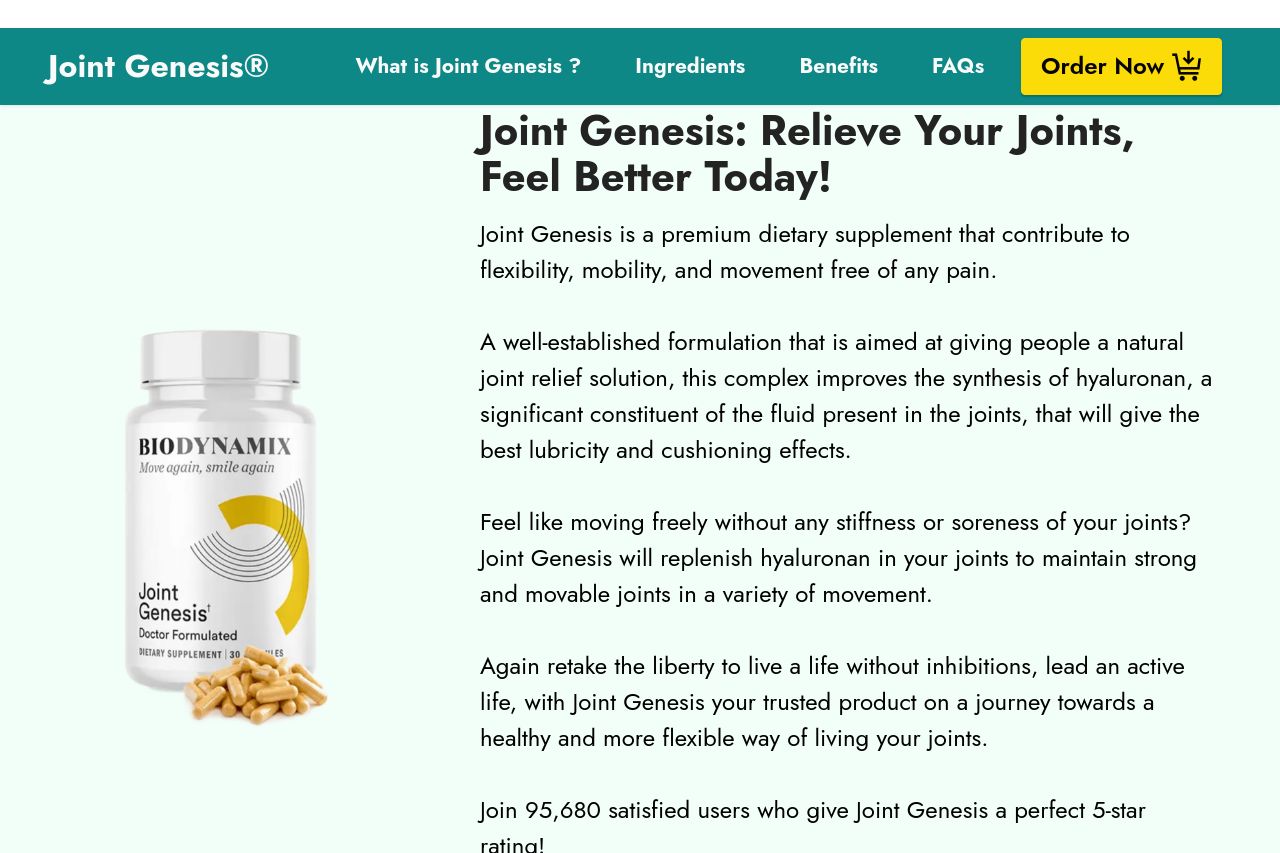
The design is consistent, clean, and professional but often feels cluttered due to the overuse of text and repetitive content. Headlines like "Joint Genesis: Relieve Your Joints, Feel Better Today!" are catchy but are followed by lengthy paragraphs that hinder readability and engagement. Visual clarity is maintained with a pleasing color scheme, but hierarchy could be improved to better guide the audience through the key messages.
Call to action buttons like "Buy Now: Only $39/Bottle" are visible but could be more strategically placed after specific benefits or features are highlighted. The presence of testimonials and trust badges is a strong point for credibility, although the testimonials are numerous and lengthy, diluting their impact.
Overall, while the site appears professional and trustworthy, there is room for improvement in clarity, hierarchy, and CTA placement to boost actionability and readability.
- Condense and prioritize text to enhance clarity and impact.
- Place CTAs strategically after key benefits to maximize conversions.
- Reduce repetitive content and focus on unique selling points.