podclip.tech
Landing Page Analysis
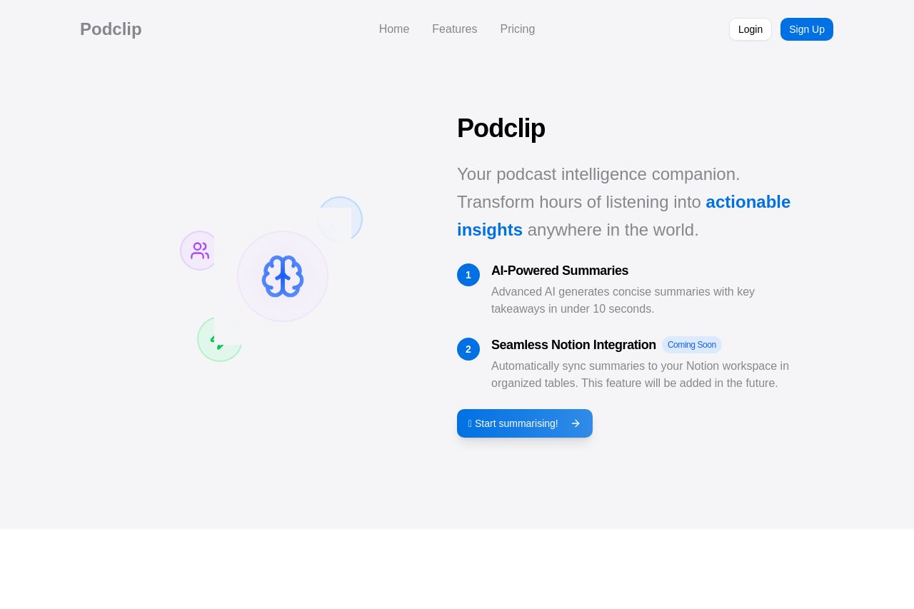
Transform your podcast listening experience with AI-generated summaries, key takeaways, and full transcriptions. Save time and never miss important insights from your favorite shows.
Summary:
Podclip does a decent job at presenting its product but struggles a bit with clarity and engagement. The hero section introduces a main value proposition, yet it feels generic, lacking a strong hook that compels users to learn more. The design is clean and professional, but some areas get visually overwhelming, and headings don't immediately pull you in. Readability suffers due to verbose text blocks and a lack of variety in visual elements. The calls to action are present but blend into the background without a sense of urgency. Structure could be more intuitive; some information feels randomly placed, missing logical connectivity. Credibility is supported by detailed feature explanations, but the absence of strong social proof could hinder trust. Overall, the page needs sharper, more impactful communication and distinct visual cues to effectively guide the user.
- Revise the value proposition to make it more engaging and specific. Focus on unique features and direct benefits.
- Improve CTA prominence by using contrasting colors and more active language.
- Enhance visual hierarchy with varied font sizes and weights for key sections.
- Include customer testimonials or logos to build credibility.
- Scroll down longer sections into more digestible parts, using bullet points and visuals.