contractorforeman.net
Landing Page Analysis
Contractor Foreman User Panel

Summary:
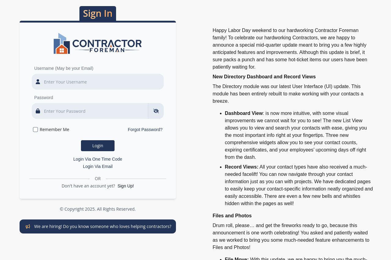
The landing page has a mix of strengths and weaknesses. The text tries hard to communicate updates and improvements, but the massive block of text is overwhelming and hard to digest. The sign-in form is functional but lacks any visual flair to engage the user. The call to actions are lackluster and do not stand out.
The credibility section is stronger than most, due to the familiarity with the Contractor Foreman brand. However, the absence of trust-inducing elements like testimonials or client logos is noticeable. Task-focused features are clearly highlighted, but the messaging does not feel as compelling or targeted as it could be. Overall, there's room for improvement in terms of design, messaging, and user engagement.
- Reduce the textual clutter by breaking paragraphs into bullet points or shorter sentences.
- Enhance the CTA with stronger visual contrast and more action-oriented language.
- Include some testimonials or client logos to boost credibility.