adele-bergzauber.de
Landing Page Analysis
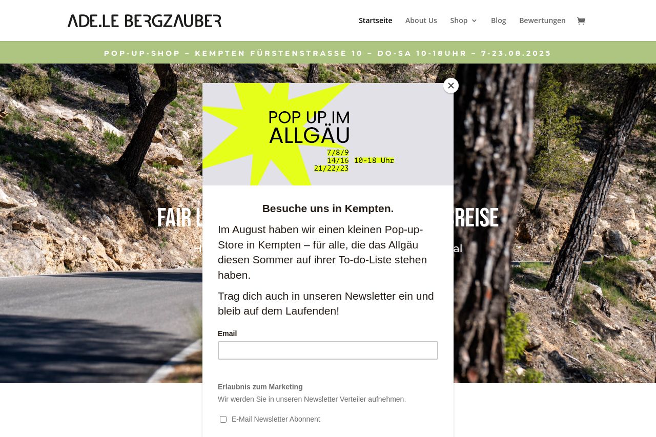
Pop-Up-Shop – Kempten Fürstenstraße 10 – Do-Sa 10-18UHR – 7-23.08.2025
Summary:
Pop-up Failure: The persistent pop-up is intrusive and disrupts user navigation. It appears on every view and dominates the screen, covering critical aspects of the site. This is a massive deterrent to user engagement.
Visual Chaos: Images are crammed without any apparent coherence or visual hierarchy. There's no logical flow, making it tough to follow the storyline or connect with the brand.
Messaging Confusion: The messaging on the pop-up lacks a strong value proposition and fails to clearly communicate what the website offers. It excessively focusses on the pop-up store, while neglecting the core brand message.
Design Inconsistency: Inconsistent design elements make the site look disjointed and amateur. The color scheme is jarring and fails to create an appealing aesthetic.
Lack of Actionability: The Call to Action is too generic. Asking visitors to sign up for a newsletter without providing tangible value is pointless and does not encourage user action.
- Remove or minimize the intrusive pop-up to improve user experience and navigation.
- Establish a coherent visual hierarchy with better organization of images and text.
- Strengthen the value proposition by clearly defining the brand's offerings beyond the pop-up store.
- Improve the design consistency to create a unified, professional look.
- Enhance CTAs with action-oriented language and clear benefits.