stripe.com
Landing Page Analysis
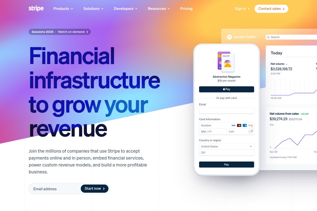
Stripe is a suite of APIs powering online payment processing and commerce solutions for internet businesses of all sizes. Accept payments and scale faster with AI.
Summary:
Stripe's landing page gets a lot right, but let's not get too comfortable patting it on the back. The design is visually appealing with great use of color, lending an air of professionalism and credibility. All their offerings are neatly categorized which helps navigate the breadth of services offered. However, the page doesn't scream originality – the heavy reliance on safe design trends makes parts of it feel templated.
On the messaging front, the value proposition is crisp and repeated well, yet the tone can come across a bit too corporate, lacking relatability especially for the more casual segments of their audience. Readability is decent, but let's not gloss over the fact that there could be more breaks in text to prevent fatigue. CTAs are mostly clear but tend to blend into the background at times, lacking aggressive standout qualities. If you're in the mood to nitpick (and we should be), social proof is abundant, but the reliance on widely recognized brands might overshadow smaller, relatable testimonials from startups or everyday users.
- Introduce more casual and relatable language in key areas to better connect with varied audience segments.
- Add more visually distinctive CTAs to capture attention and encourage action, possibly by employing bolder colors or different placements.
- Integrate more personal testimonials from smaller companies or individual users to complement big-name logos and create relatable social proof.