dampfsauger.shop
Landing Page Analysis
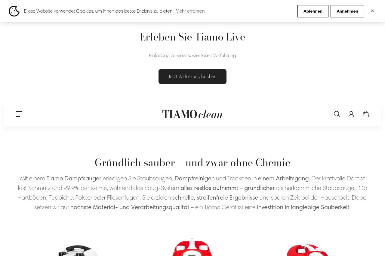
Entdecke die Welt von Tiamo – Hochleistungs-Dampfsauger und Premium-Reinigungszubehör für kompromisslose Sauberkeit. Unsere innovativen Systeme vereinen Dampf-, Saug- und Wasserfiltrationstechnologie
Summary:
The Tiamo landing page has a strong focus on positioning its cleaning products as innovative and efficient. The main value proposition is clear with an emphasis on chemical-free, effective cleaning. Visuals of the products are well-integrated, enhancing understanding and appeal to the audience, which is likely homeowners and allergy sufferers. However, the design could benefit from a touch more personality; it feels rather clinical and could use some warmth. The CTAs stand out, but there are inconsistencies in tone and layout that disrupt the flow.
Messaging is decent, though the overuse of technical terms without enough lay explanations might alienate some users. Readability is generally good, but some text areas are dense and could be better formatted. The design is functional but somewhat bland, lacking emotional engagement with the user. Structurally, the information is well-organized; however, the navigation could be clearer. CTAs are well-placed but lack urgency or compelling reasons to act now. The credibility section benefits from well-presented testimonials and certifications, but should enhance emotional connection and relatability.
- Add more emotional appeal to the design for warmth and connection, possibly through imagery or background colors.
- Simplify technical jargon for better understanding across a broader audience.
- Enhance the sense of urgency in CTAs to encourage immediate action.