swipeone.com
Landing Page Analysis
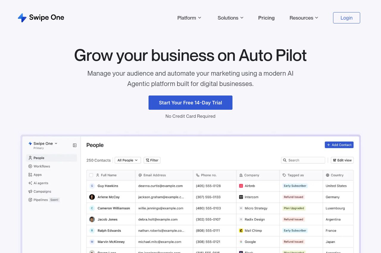
Manage your audience and automate your marketing using a modern AI Agentic platform built for digital businesses.
Summary:
The landing page for Swipe One is visually clean and easy to navigate, but it lacks a strong sense of differentiation and compelling calls to action. While the visual style and design elements are consistent, key information is sometimes buried or lacks emphasis, such as explicit benefits or features that truly set the product apart. The text is simple and direct, which is good, but the lack of engaging language makes it feel somewhat generic. The consistent use of CTA buttons is a plus, though the urgency and motivation behind them are not strongly conveyed. Social proof elements are completely missing, leaving users without a sense of trust or reliability in the brand's capabilities.
- Highlight unique selling points more prominently.
- Incorporate social proof like testimonials or client logos.
- Improve CTA motivation and urgency.