globalnorthstar.com
Landing Page Analysis
Northstar Club Management Software offers a comprehensive solution to its clients with the Club App, Custom Websites, KDS, Tee Times, POS, etc. Contact us!

Summary:
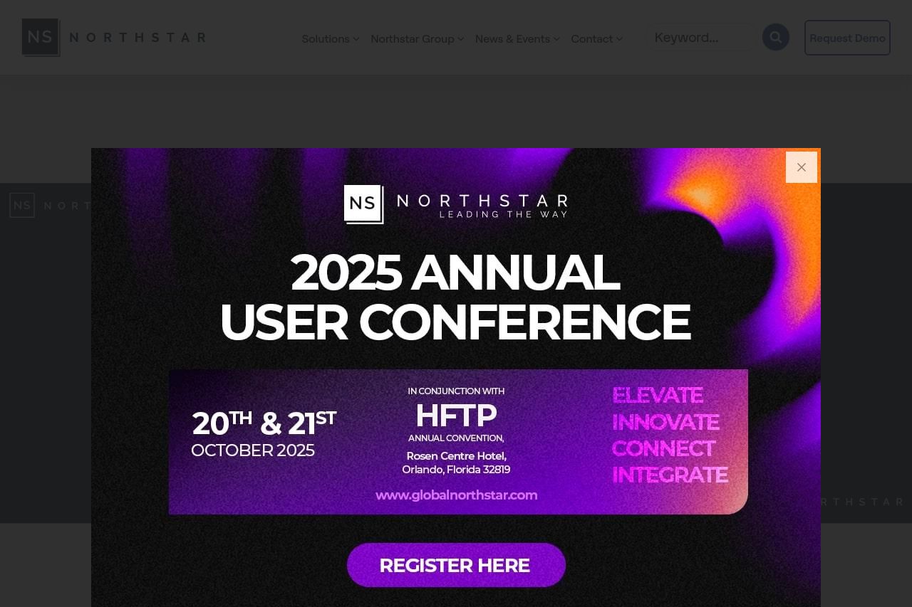
Overall, the page presents a strong visual appeal with a bold color palette. The purple and black theme creates contrast, making key details like the event and "Register Here" button stand out effectively. The consistent use of layout across all screenshots is commendable but repetitive popup ads detract from user experience. Content-wise, fine-tuning is needed. While the "2025 Annual User Conference" message is clear, additional context about the relevance and significance of the event would enhance understanding and engagement. Tone and typography suit the professional vibe, yet more dynamic language or compelling details could lift the messaging. Navigation seems hidden behind the popups, which may frustrate users who seek direct access to the site's offerings beyond this reminder.
- Avoid repetitive pop-ups to enhance user experience.
- Add more engaging context about the user conference's benefits and target attendees.
- Improve navigation clarity and ease for better user journey.