disrupt.com
Landing Page Analysis
Disrupt.com is a venture builder and investor, creating and funding AI-first startups, partnering with founders, and fueling innovation with capital and expertise.
Summary:
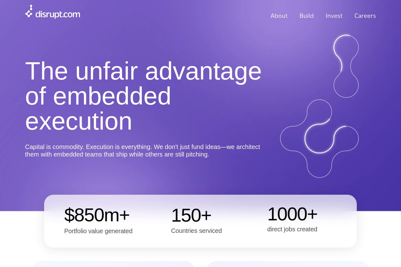
The landing page for Disrupt.com is mostly cohesive with a clear target. The hero section strongly communicates the product's value proposition with bold, high-contrast text over a pleasing purple gradient. However, it's a bit verbose in describing the service, which could be a turn-off for visitors looking for quick information. The emphasis on numbers ($850m+, 150+, 1000+) does a great job of showcasing credibility and impact. The design is consistent with the use of a purple color scheme and adequate white space to separate sections, although this purple motif does start to feel monotonous as it fills the page uniformly.
The call-to-actions feel too uniform and do not stand out as much, especially near content-heavy sections like "Our areas of focus". The sections could benefit from a bit more diverse styling to break the monotony. 'Build with us' and 'Grow with us' buttons need a greater degree of differentiation and prominence.
The messaging is targeted toward builders and founders, which is a clear choice for a venture builder, but the execution feels somewhat generic and could use more concrete examples of how the company executes these visions. In general, the text is detailed and informative but could be simplified to enhance readability.
The site’s credibility factors are strong with clear client logos and updates displayed, but social proofs, like testimonials, would help in acquiring trust quicker.
- Enhance CTA visibility by using contrasting colors or larger size.
- Simplify the text in content-dense sections for readability.
- Incorporate testimonials or client feedback for added credibility.
- Break up the purple color scheme with complementary colors to prevent monotony.