studentevolution.co
Landing Page Analysis
Online
Summary:
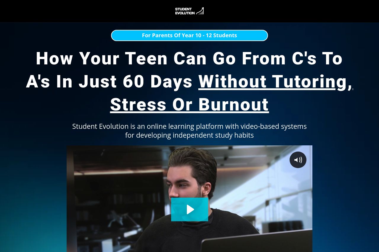
The Student Evolution landing page is a mixed bag of strengths and weaknesses. The messaging effectively targets parents of high school students by clearly identifying the target audience and addressing their pain points. However, while the value proposition is stated, it could benefit from more clarity and repetition across the platform. The design is visually appealing with a consistent color scheme that enhances the call-to-action buttons, but it struggles with visual hierarchy at times, which can hinder readability. The structure is generally cohesive, but sections might benefit from better headings for easier navigation. The call-to-action elements are relevant and stand out, though their placement could be more strategic for better user flow. Credibility is supported by testimonials and a sense of professionalism, yet there's room for more transparent information about the company. Overall, improvements in structure and additional clarity in messaging could elevate the effectiveness of the page.
- Improve the visibility and clarity of the main value proposition across the page.
- Enhance headings for easier navigation and improved information hierarchy.
- Ensure CTAs are strategically placed for better user engagement and flow.